Karel’s TEDx talk is published right on time. It highlights some arguments why the European legislation about medicines information in package leaflets needs to be changed.
Enabling patients by listening to them
Karel’s TEDx talk “Enabling patients” is published right on time. It highlights some arguments why the European legislation about medicines information in package leaflets needs to be changed.
Fortunately, it is now possible to provide feedback about a proposal for revision of this legislation. The deadline is November 8.
If the proposal is not modified, we’ll continue to have these useless, expensive, unsustainable, and embarrassingly poor leaflets for a few more decades. Patients deserve better.
IIID will provide feedback about the proposed revision to the European Commission.
Rui Camilha introduces award-winning legal information design from Villa – Visual Law Studio, in Brazil.
Legal Design for Legal Efficiency
Villa is the leading company in Latin America specializing in Visual Law and Legal Design, recognized as the largest and most awarded in this field. Our main goal is to enhance legal communication, making it more efficient for the public and for businesses seeking transparent and accessible relationships with their consumers.
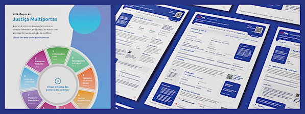
In this presentation, we are delighted to share two of the most iconic projects that mark our journey. We will explore the complete process of ideation, development, and the results achieved. The first project is the “Easy Contract for TIM,” a mobile telecommunications adhesion contract designed to transform store customer experience. We will discuss how we implemented Visual Law and Legal Design techniques in this contract, simplifying the legal content and making it more understandable and user-friendly for TIM’s customers.
The second project we will present is the “Visual Law and Plain Language Handbook,” created for the Court of Justice of Mato Grosso. This handbook was developed with the aim of teaching Brazilian judges the methodology of project creation using Visual Law and clear language. In addition to explaining how the handbook was developed, we will highlight how the implementation of these practices can encourage more effective communication between magistrates and the public, especially in complex legal cases.
During the presentation, we will explore the challenges faced during the development of these projects, as well as the benefits and results achieved. We will share valuable insights on how Visual Law and Legal Design can revolutionize legal communication, making it more accessible, understandable, and, above all, efficient.
Introducing Rui Caminha: Lawyer, digital entrepreneur, graduate from the University of São Paulo, currently pursuing a master’s degree at FGV-SP. Founder and CEO of Juristec+, co-founder, and director of Villa – Visual Law Studio. Legal Design lecturer, international presenter, with over 15 years dedicated to legal innovation, and pioneer in the development of technologies and solutions in legal data analytics, legal AI, analytics, and Visual Law.
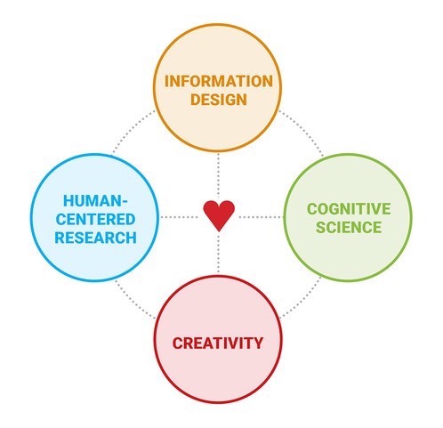
Information designers know that they should create solutions that address users’ needs. But while some of us claim to do it all the time, in reality many find it hard to integrate this way of working into our daily practice.
A human-centered research clinic for information designers
Information designers know that they should create solutions that address users’ needs. We accept the need for human-centered research, and we promote it to our clients. But while some of us claim to do it all the time, in reality many find it hard to integrate this way of working into our daily practice – to find participants, to design studies, to identify what to ask, to interpret results.
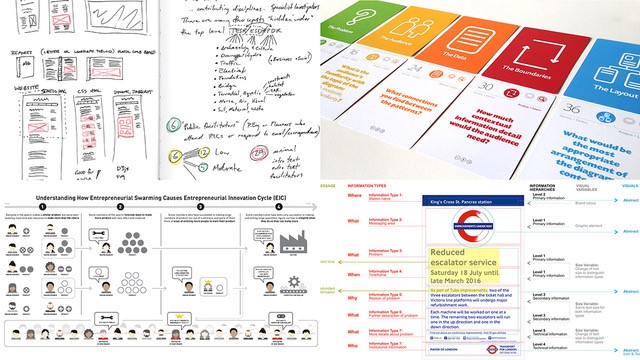
Sheila Pontis, one of the foremost experts on human-centered research for information design, will introduce her own work, and answer your questions on how to bring research into practice. The session will be a dialogue, structured around your questions submitted in advance.
For example, you might ask: I’ve to create a visual explanation about quantum computing for children – how can I know where I should focus on or what concepts are harder for them to understand? I’ve developed icons for a multicultural venue – how can I be sure they’ll be understood? I’m working on information about a medical treatment but can’t get access to real patients – how can I work around this? How many people do I need to recruit to test a new app I’ve designed?
Originally from Argentina, Dr Sheila Pontis has degrees from the University of Buenos Aires (BA), the University of Barcelona (MA, MPhil), and London College of Communication, University of the Arts London (PhD). She is now based in the USA, where she teaches and researches at MIT, and is a partner at Sense Information Design, New York. Her research bridges and contributes to several domains, including creativity and well-being, information science, human-computer interaction, information design, sensemaking and cognitive science. She is also active as reviewer of several journals and conferences.
Sheila is the author of three books: Making Sense of Field Research: A Practical Guide for Information Designers (Routledge, 2018), Communicating Knowledge Visually: Will Burtin’s Scientific Approach to Information Design (RIT Press, 2021, co-authored with R. Roger Remington), and Information Design Unbound: Key Concepts and Skills for Making Sense in a Changing World (Bloomsbury, November 2023, co-authored with Michael Babwahsingh).
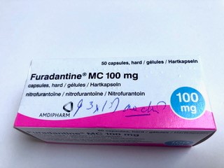
Taking medicines is a stressful activity. Opening a cardboard box, reading a leaflet, handling tiny pills, checking the dosage and the time, and considering potential side-effects require the capacities of a strong, astute, and healthy adult.
Medicines information: Are we really enabling patients to take medicines?
Taking medicines is a stressful activity. Opening a cardboard box, reading a leaflet, handling tiny pills, checking the dosage and the time, and considering potential side-effects require the capacities of a strong, astute, and healthy adult. Several of these activities are fairly difficult, especially when our dexterity, eye-sight, and mental flexibility decreases.
Karel van der Waarde will show examples of medical information design in context. He will question their use and provide reasons from both industry and regulations why these situations change so slowly.
Karel van der Waarde studied graphic design in the Netherlands (The Design Academy, Eindhoven), and the UK (De Montfort University (Leicester), and Reading University). He started in 1995 a design- research consultancy in Belgium. The company develops and tests patient information leaflets, instructions, forms, and protocols in both digital and analogue formats. Most of the projects are related to information about medicines for patients, doctors and pharmacists. (www.graphicdesign-research.com) In 2023 he teaches at BA, MA, and PhD level at the Lucerne University of Applied Sciences and Arts (Switzerland), and University of Hasselt (Belgium). He is a board member of International Institute for Information Design (IIID, Vienna, Austria) and the International Plain Language Federation (IPLF), and editorial board member of Information Design Journal, Hyphen, She Ji, and Visible Language.
“I have read and understood the terms and conditions” is the biggest lie on the internet – no one reads, and definitely no one understands (except the lawyers).
Legal Information Design: Towards user-friendly contracts
“I have read and understood the terms and conditions” is the biggest lie on the internet – no one reads, and definitely no one understands (except the lawyers).
When most of us hear “contracts”, we think of impenetrable walls of legalese envisioned to protect a party at the expense of the other. But there’s another way. Through information design, contracts can be transformed into tools that work better for business, for people, and ultimately for society.
Stefania Passera, a pioneer of contract design, will show examples of her work and discuss the impact of this new, multidisciplinary approach to contracts. Legal information design is a fast-growing marketplace for information design skills and this talk will introduce IIID members to one of its leading figures.
Stefania, founder of Passera Design, is an information designer specialized in contract design and simplification based in Helsinki, Finland. With 10+ years of experience in the field, she is considered a true legal design pioneer. She collaborates with World Commerce & Contracting as Contract Designer in Residence and as curator of the Contract Design Pattern Library.
She has served as an Assistant Professor at the University of Vaasa, Department of Business Law (Finland), and earned her doctoral degree from Aalto University (Espoo, Finland). Her research has been published internationally, and she is an in-demand speaker and lecturer on contract and legal design. Her impact as a legal design pioneer has been recognized with a European Women of Legal Tech 2020 award and a WorldCC Fellowship.
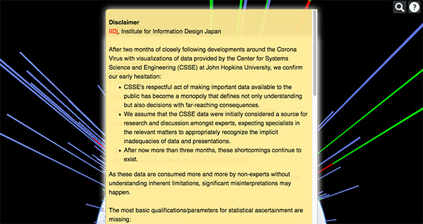
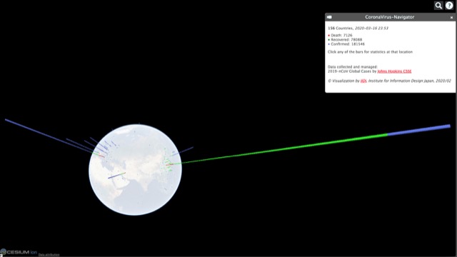
Comment by Andreas Schneider, Institute for Information Design Japan, on the quality of data provided by the Center for Systems Science and Engineering (CSSE) at John Hopkins University, basis for the “Corona Navigator” featured in a previous post.
Comment by Andreas Schneider, Institute for Information Design Japan, on the quality of data provided by the Center for Systems Science and Engineering (CSSE) at John Hopkins University, basis for the “Corona Navigator” featured in a previous post.
As these data are consumed more and more by non-experts without understanding inherent limitations, significant misinterpretations may happen.
The full comment is available on the IIDj website.
The Japan Sign Design Association Award (as known as SDA Award) was established in 1966 for the purpose of promoting and educating the public about the sign design through presentation of signature design works to the wide society.
The Japan Sign Design Association Award (as known as SDA Award) was established in 1966 for the purpose of promoting and educating the public about the sign design through presentation of signature design works to the wide society.
It continues to be the only award program for sign design in Japan. Signs today are considered as an interface that connects urban space or corporate activities with consumers, or as information that is indispensable for revitalizing the environment and establishing communication, and their examples are seen with more diverse variations.
The Japan Sign Design Association invites applications for awards from signature design works with high quality.
Although we are constantly updating and expanding our visualizations around the developments of the spread of the Corona virus, we are painfully aware of the underlying limitations and the risks of statistical communication.
Although we are constantly updating and expanding our visualizations around the developments of the spread of the Corona virus, we are painfully aware of the underlying limitations and the risks of statistical communication. Numbers, exuding a certain authority, may draw attention in ways that are not appropriate to the issues they claim to represent.
While it is extremely important to put quantitative information in context, we lack the detail to do so in a meaningful way: the number of tests performed, population, demographic profiles and many others.
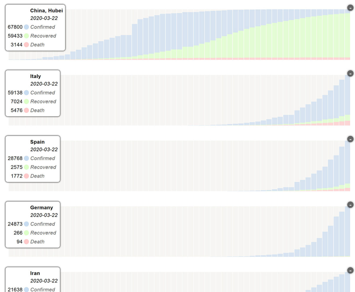
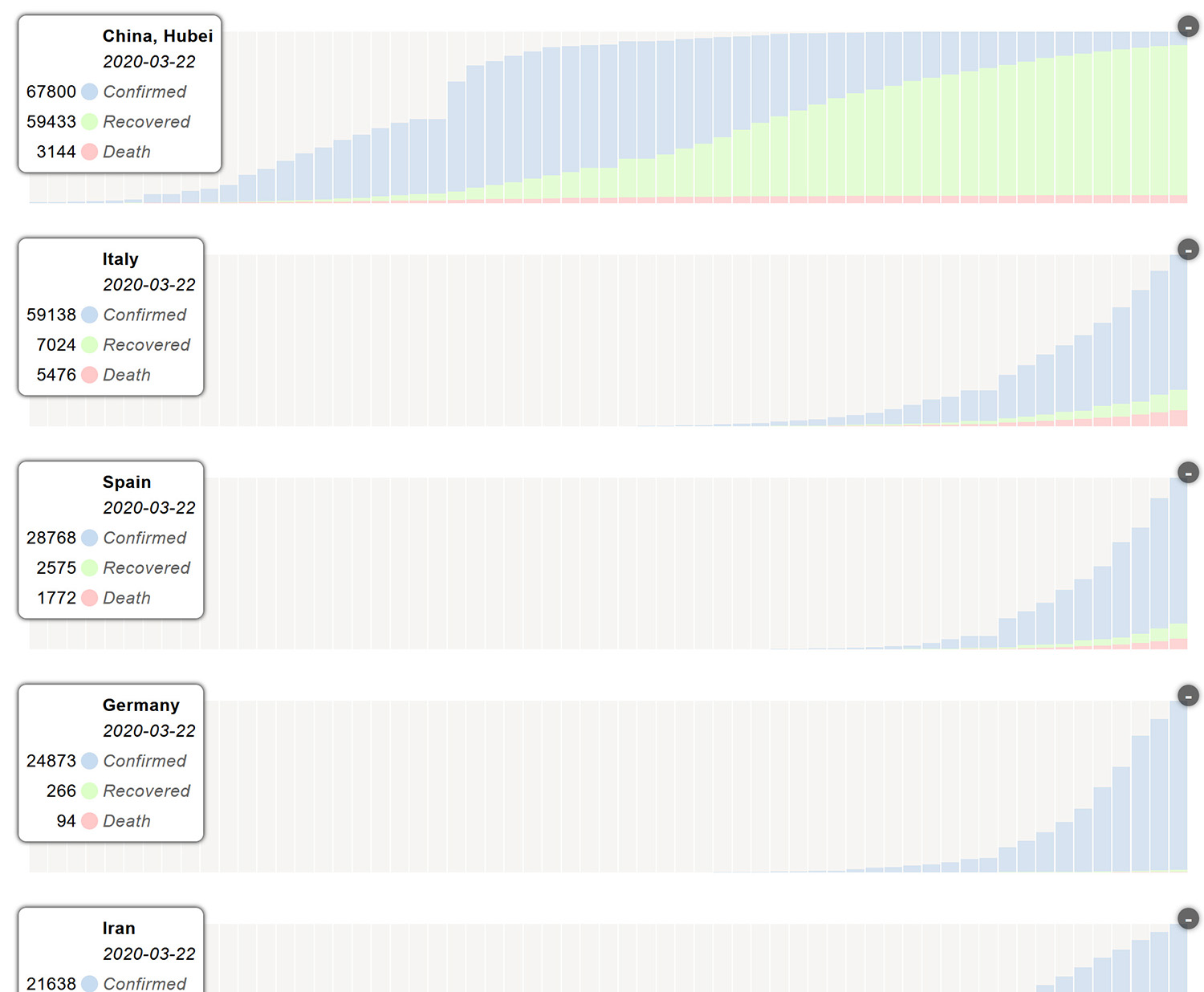
We have added a new view, charts, which should help to better understand the dynamics of development at each location. These diagrams are scaled to facilitate comparative reading – they do not allow quantitative comparisons in any way.
We have added a new view, Charts, which should help to better understand the dynamics of development at each location. These diagrams are scaled to facilitate comparative reading – they do not allow quantitative comparisons in any way. https://api.iidj.net/cv/charts
Data collected and managed by Center for Systems Science and Engineering (CSSE) at John Hopkins University – Great Work! https://url.iidj.net/arcgis_75MX
Andreas Schneider Institute of Information Design Japan iidj 2020-03-23.
X-Ray Visualization: A Fine Tradition of Visualizing Medical Data – Plus, introducing a new contest for healthcare visualizations.
X-Ray Visualization: A Fine Tradition of Visualizing Medical Data – Plus, introducing a new contest for healthcare visualizations.
By Will Stahl-Timmins, Data visualisation designer, British Medical Journal, and John Appleby, Director of Research and Chief Economist, The Nuffield Trust
There is a fine tradition of innovation in the visual presentation of health and care data. John Snow produced a map of Cholera cases during the 1854 outbreak in London, England. It clearly shows cases clustered around the Broad Street water pump — the source of infection. A list of addresses would be far harder to interpret than the map. Perhaps Snow realised that the human visual system’s capacity for pattern finding could be harnessed by using data maps such as these.
Visualising health inequalities—Announcing a new data visualisation competition in healthcare. Given the ubiquity of data in our lives it is perhaps unsurprising that methods to help us understand this rising tide of digits have become increasingly popular.
Visualising health inequalities—Announcing a new data visualisation competition in healthcare.
Given the ubiquity of data in our lives it is perhaps unsurprising that methods to help us understand this rising tide of digits have become increasingly popular.12 Techniques such as bar and line charts have helped us to see patterns in numerical data since at least the late 18th century.3 However, the digital revolution has boosted the possibilities for visualising data, and there is now a thriving field of practice and research in “data visualisation.”
Andreas Schneider from IIDj, Institute for Information Design Japan sent this article.
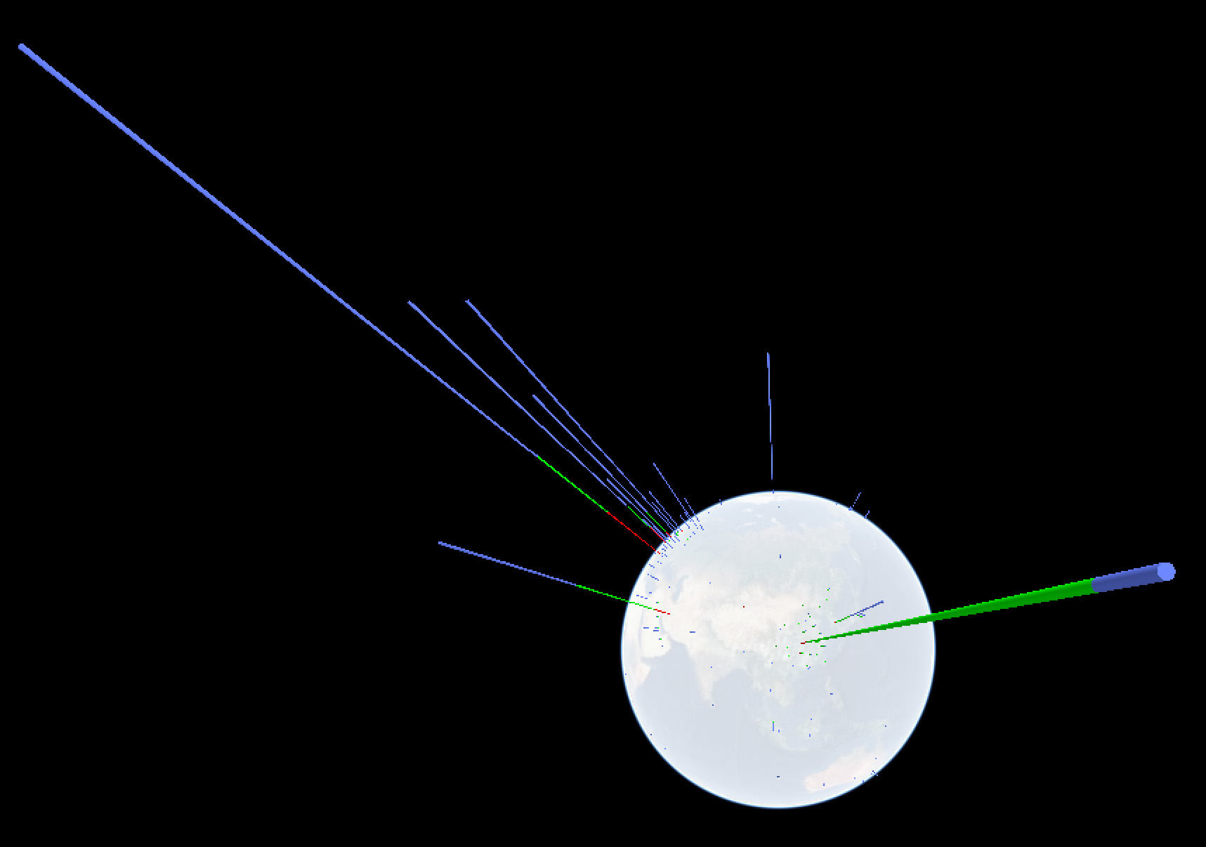
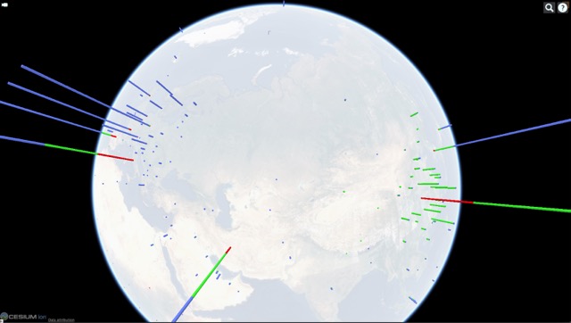
Corona virus navigator: IIDj keeps a live 3-D visualization of the virus’ geographic appearance within the limitations set by insufficient data, based on the LiveTracker of the Center for Systems Science and Engineering (CSSE) at John Hopkins University, US
Following the development of presentations around the coronavirus evolution we feel obliged to raise our concerns:
Numbers are only meaningful if they refer to a known metric – the sum of the identified infections must be reported together with the total number of persons testedpresentations have to consider and communicate three phases: IDENTIFICATION, RECOVERY, FATALITIES.
Data should be provided by SITES, identifiable significant agglomerations / communities – and not by arbitrary political entities – such as province or country.
The number of cases cannot be visualized as blobs of varying size on 2-dimensional maps, giving the impression of a geographical spread when the underlying data is the total within an arbitrary political boundary – such as province or country.
Color schemes should enable understanding rather than cause fear.
AUTHORSHIP/SOURCE of data/information used must be clearly stated, including contact details for questions and feedback.
We keep updating the live 3-D visualization of the virus’ geographic appearance within the limitations set by insufficient data, based on the LiveTracker of the Center for Systems Science and Engineering (CSSE) at John Hopkins University, USA. https://api.iidj.net/cv/ https://api.iidj.net/cv/timeline
We hope that the respective authorities will make efforts to provide appropriate data in a consistent format. This is necessary for responsible decision-making at personal and political levels that can count on the understanding of all concerned.
Data collected and managed by Center for Systems Science and Engineering (CSSE) at John Hopkins University. https://url.iidj.net/arcgis_75MX
Context, worldwide: According to WHO, 15 deaths every minute = 8MIO per year through AIR POLLUTION https://url.iidj.net/who_ghZS According to WHO, 15+ deaths every minute = 8MIO+ per year through TOBACCO USE https://url.iidj.net/who_7745 According to WHO, 3 deaths every minute = 1.6MIO per year directly caused by DIABETES (2016) https://url.iidj.net/who_HL21