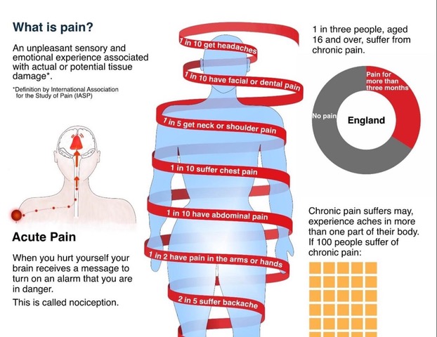
Rita Giordano wrote about the process of developing visualisations about pain. She describes how infographics could be transformed to better reflect patients’ needs.
A quote: ‘We need to be careful about how we display the information and communicate clearly with plain language while avoiding jargon. More importantly, we need to involve patients; their input is critical in shaping the final product. As information designers, we need to not only understand how patients understand visual information, but also how they respond to it emotionally.’
The article concludes:
Never assume. Always ask for feedback. Many people are willing to help.
Engaging patients in your healthcare project will be rewarding.
Ask medical experts for their thoughts and insights into the scientific findings.
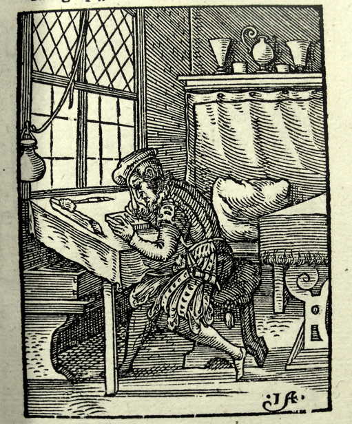
This book applies information design to the understanding of woodcuts. Free download.
This book applies insights from information design to the interpretation of images in woodcut-illustrations.
The study by Andrea van Leerdam shows how woodcuts in vernacular books on medicine and astrology fulfilled important rhetorical functions in knowledge communication. These images guide readers’ perceptions of the organisation, visualisation, and reliability of knowledge.
From the introduction: ‘I draw on ideas on visual rhetoric from the field of information design studies, as outlined below. This field shares with book history the foundational assumption that materiality affects meaning. Choices in design always reflect assumptions held implicitly or explicitly by the designers on how a message can be conveyed effectively.’
Page 35: ‘Ideas from information design studies contribute to a more systematic understanding of the concept. The practical outlook of this field – which design solutions work well under what circumstances, and why? – is instrumental for book historians to work the other way around, as we might say: to reconstruct the possible ways in which early modern book design made meaning.’
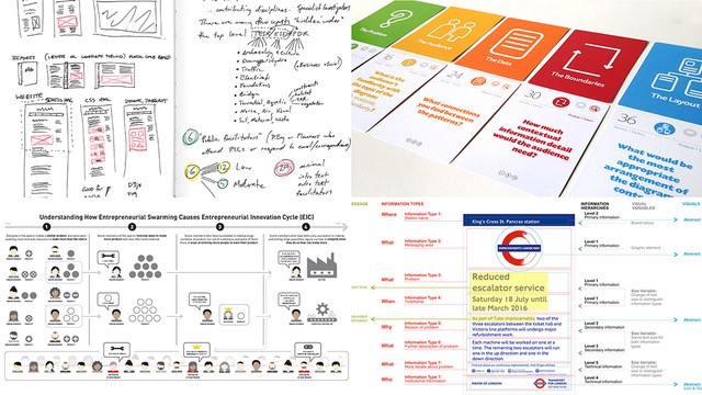
Information designers know that they should create solutions that address users’ needs. But while some of us claim to do it all the time, in reality many find it hard to integrate this way of working into our daily practice.
A human-centered research clinic for information designers
Information designers know that they should create solutions that address users’ needs. We accept the need for human-centered research, and we promote it to our clients. But while some of us claim to do it all the time, in reality many find it hard to integrate this way of working into our daily practice – to find participants, to design studies, to identify what to ask, to interpret results.
Sheila Pontis, one of the foremost experts on human-centered research for information design, will introduce her own work, and answer your questions on how to bring research into practice. The session will be a dialogue, structured around your questions submitted in advance.
For example, you might ask: I’ve to create a visual explanation about quantum computing for children – how can I know where I should focus on or what concepts are harder for them to understand? I’ve developed icons for a multicultural venue – how can I be sure they’ll be understood? I’m working on information about a medical treatment but can’t get access to real patients – how can I work around this? How many people do I need to recruit to test a new app I’ve designed?
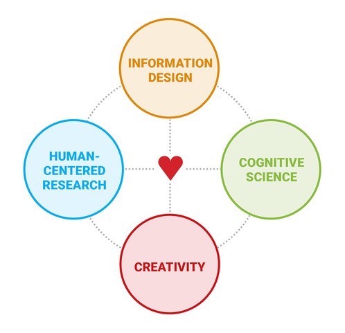
Originally from Argentina, Dr Sheila Pontis has degrees from the University of Buenos Aires (BA), the University of Barcelona (MA, MPhil), and London College of Communication, University of the Arts London (PhD). She is now based in the USA, where she teaches and researches at MIT, and is a partner at Sense Information Design, New York. Her research bridges and contributes to several domains, including creativity and well-being, information science, human-computer interaction, information design, sensemaking and cognitive science. She is also active as reviewer of several journals and conferences.
Sheila is the author of three books: Making Sense of Field Research: A Practical Guide for Information Designers (Routledge, 2018), Communicating Knowledge Visually: Will Burtin’s Scientific Approach to Information Design (RIT Press, 2021, co-authored with R. Roger Remington), and Information Design Unbound: Key Concepts and Skills for Making Sense in a Changing World (Bloomsbury, November 2023, co-authored with Michael Babwahsingh).
X-Ray Visualization: A Fine Tradition of Visualizing Medical Data – Plus, introducing a new contest for healthcare visualizations.
X-Ray Visualization: A Fine Tradition of Visualizing Medical Data – Plus, introducing a new contest for healthcare visualizations.
By Will Stahl-Timmins, Data visualisation designer, British Medical Journal, and John Appleby, Director of Research and Chief Economist, The Nuffield Trust
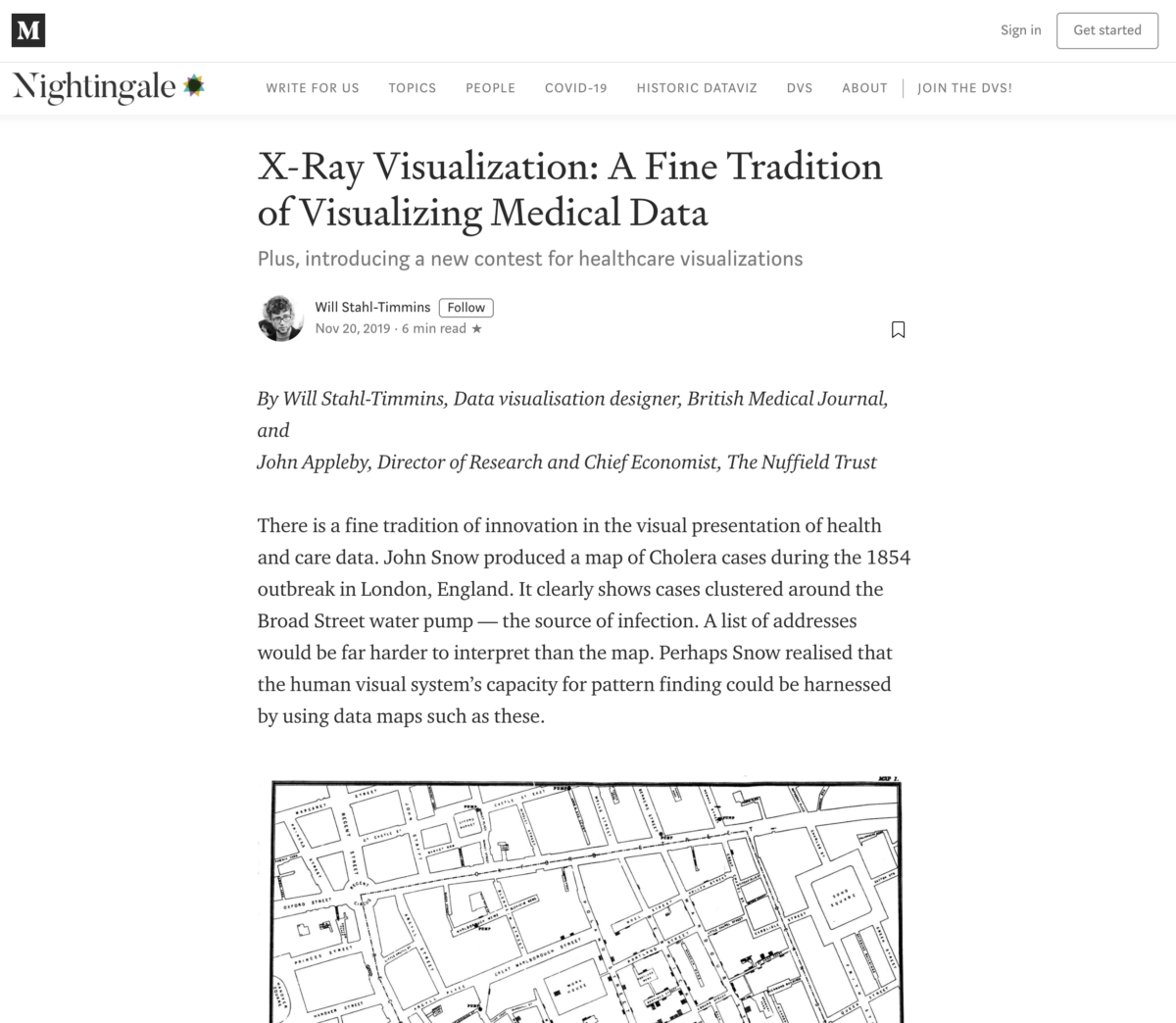
There is a fine tradition of innovation in the visual presentation of health and care data. John Snow produced a map of Cholera cases during the 1854 outbreak in London, England. It clearly shows cases clustered around the Broad Street water pump — the source of infection. A list of addresses would be far harder to interpret than the map. Perhaps Snow realised that the human visual system’s capacity for pattern finding could be harnessed by using data maps such as these.