Details
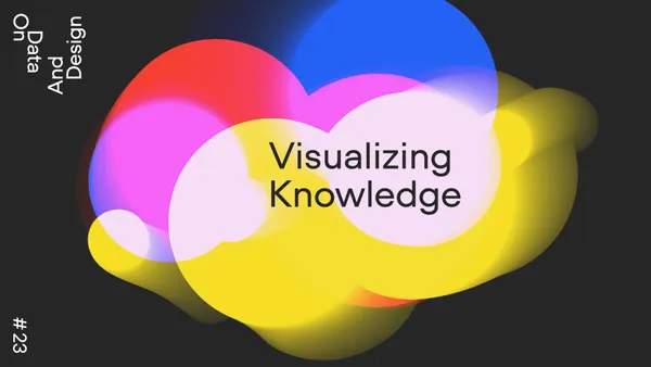
What do we know about an issue? What really is knowledge compared to the actual practice? Shedroff’s theory states that data leads to information, information leads to knowledge, and knowledge leads to wisdom of an individual. What role can visualization play in this? How can visualizations lead to new knowledge? In what ways can we create knowledge?
In our next event we want to explore the question whether visualizing knowledge could be the key to faster understanding, inclusion and a new form of learning and discussion. Let’s visualize the given and the imagined to create knowledge for the future.
The next event will be in English only on YouTubeLive. You will be able to ask questions via Slido.
IMPORTANT: Please RSVP for the event, so that we can send you the online link and additional information.
And here are the speakers:
Barbara Vissirini, a Berlin based communication designer, will talk about her latest award winning project – Dieses kleine Buch ist für dich: A visual grammar for German as a Foreign Language. She will share with us the basics behind her design research and the developed visual system. We are curious to see if this book could be a first step into learning new languages with fun and visual logic.
Valentina D’Efilippo, a London-based designer, illustrator and creative director. Whose work has been part of the permanent collection of Austria’s largest anthropological museum, the Weltmuseum Wien, and her book “The Infographic History of the World” has been translated into nine languages. Valentina will talk about her latest projects and her experiences with illustrating history and human development through data visualization and infographic storytelling.
Dario Rodighiero, is an Assistant Professor of Sciences and Technology Studies at the University of Groningen, a principal of metaLAB (at) Harvard, and a member of the Berkman Klein Center for Internet & Society. As an interdisciplinary researcher and designer, Dario will take us to the intersection of knowledge design, critical data, and digital humanities, focusing on the creative possibilities of visualizations and the digital mapping of knowledge.
Darjan Hil from Superdot will host the next On Data And Design online session live on Youtube.
Further Links:
Youtube at ► https://www.youtube.com/@OnDataAndDesign/videos
Tweet at ► https://twitter.com/onDataAndDesign
Eventbrite Group ► https://ondataanddesign.eventbrite.ch
Meetup Group ► https://www.meetup.com/de-DE/ondataanddesign-Switzerland/
Linkedin ► https://www.linkedin.com/showcase/71529252
Superdot ► https://www.superdot.studio/
Instagram ► https://www.instagram.com/ondataanddesign/


