Andreas Schneider from IIDj, Institute for Information Design Japan sent this article.
Following the development of presentations around the coronavirus evolution we feel obliged to raise our concerns:
- Numbers are only meaningful if they refer to a known metric – the sum of the identified infections must be reported together with the total number of persons testedpresentations have to consider and communicate three phases: IDENTIFICATION, RECOVERY, FATALITIES.
- Data should be provided by SITES, identifiable significant agglomerations / communities – and not by arbitrary political entities – such as province or country.
- The number of cases cannot be visualized as blobs of varying size on 2-dimensional maps, giving the impression of a geographical spread when the underlying data is the total within an arbitrary political boundary – such as province or country.
- Color schemes should enable understanding rather than cause fear.
- AUTHORSHIP/SOURCE of data/information used must be clearly stated, including contact details for questions and feedback.
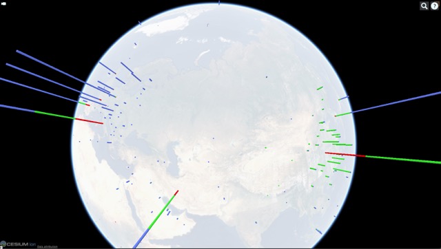
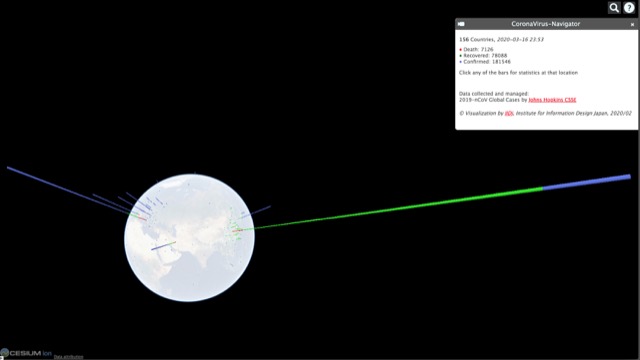
We keep updating the live 3-D visualization of the virus’ geographic appearance within the limitations set by insufficient data, based on the LiveTracker of the Center for Systems Science and Engineering (CSSE) at John Hopkins University, USA.
https://api.iidj.net/cv/
https://api.iidj.net/cv/timeline
We hope that the respective authorities will make efforts to provide appropriate data in a consistent format. This is necessary for responsible decision-making at personal and political levels that can count on the understanding of all concerned.
Data collected and managed by Center for Systems Science and Engineering (CSSE) at John Hopkins University. https://url.iidj.net/arcgis_75MX
Context, worldwide:
According to WHO, 15 deaths every minute = 8MIO per year through AIR POLLUTION https://url.iidj.net/who_ghZS
According to WHO, 15+ deaths every minute = 8MIO+ per year through TOBACCO USE https://url.iidj.net/who_7745
According to WHO, 3 deaths every minute = 1.6MIO per year directly caused by DIABETES (2016) https://url.iidj.net/who_HL21