Visualising chronic pain.

Rita Giordano visualised pain and wrote about it.

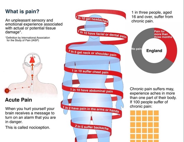
Rita Giordano wrote about the process of developing visualisations about pain. She describes how infographics could be transformed to better reflect patients’ needs.

A quote: ‘We need to be careful about how we display the information and communicate clearly with plain language while avoiding jargon. More importantly, we need to involve patients; their input is critical in shaping the final product. As information designers, we need to not only understand how patients understand visual information, but also how they respond to it emotionally.

The article concludes:

  1. Never assume. Always ask for feedback. Many people are willing to help.
  2. Engaging patients in your healthcare project will be rewarding.
  3. Ask medical experts for their thoughts and insights into the scientific findings.

Website of the author: Rita Giordano

Website: Infogr8

Article in ‘Nightingale’

A case study about the visualisation of a large data set.

An article by Will Stahl-Timmins and Nadieh Bremer ‘Showing Human Stories Behind Data Points’ has just been published in Nightingale.

The article describes the considerations that go into the development of a visual to show ‘35,000 recorded cases of rape, sexual assault, harassment, stalking, and abusive remarks between 2017 and 2022 in health facilities run by the UK’s NHS (National Health Service)’.

The article concludes: ‘There are no hard rules, no correct answers. … There is always a healthy dose of personal judgment that is needed to find the right balance and there are plenty of individual decisions to make about scales and formats, which will depend on the project being worked on.’

New Book: ‘Herbert Bayer’s World Geo-Graphic Atlas and Information Design at Midcentury’

A new book by Benjamin Benus.

From the publisher: ‘Between 1947 and 1953, the Austrian-born, Bauhaus-trained artist Herbert Bayer (1900–1985) oversaw the design and production of the World Geo-Graphic Atlas, a landmark work of graphic design and data visualization. Benjamin Benus tells the story behind this work’s creation. Benus’s account reconstructs the working methods and intellectual exchanges through which Bayer and his circle of scientific collaborators realized this remarkable work.

Author: Benjamin Benus

A review by Steven Heller in The Daily Heller (July 31, 2023)

Published by: Rochester Institute of Technology, RIT Press.

Visualizing Complexity Science Workshop

Visualizing Complexity Science Workshop by Paul Kahn and Liuhuaying Yang (Vienna, August 28- September 1)

Paul Kahn and Liuhuaying Yang offer a 5-day workshop on Visualising Complexity Science.

The Visualizing Complexity Science Workshop brings together multiple perspectives in information design and data visualization to create complexity science visualizations. Teams will combine researchers together with data visualization designers, data journalists, and data artists engaged in advanced visualization projects.

The program is designed to be diverse, creative and inspiring, offering a mix of lectures by the hosts, invited guest speakers from the international data journalism and visualization community, group discussions, and hands-on working sessions engaging with complexity science research datasets.

Location: Complexity Science Hub, Vienna, Austria

Dates: Monday August 28 – Friday September 1, 2023

Registration deadline: May 20, 2023

More details and registration: Visualizing Complexity Science Workshop Website

Book: ‘Information Visualisation’

New book by Maria dos Santos Lonsdale about ‘Information Visualisation’.

The publisher states: ‘In a world of information overload, this book will help you to cut through the noise and communicate information with clear, efficient, and engaging visualisations. 

This book:  

• Explains the principles behind information visualisation, including the science of visual perception and cognition
• Provides guidelines that bring research and best practice together
• Showcases a range of examples, and outlines the do’s and don’ts of different approaches
• Shows how to use research methods to design with and for your target audience. 

From an expert with years of experience researching, teaching, and doing information visualisation, learn how to make better and informed decisions around visualisation design that are appropriate for both your data and audience.’

Foreword written by Prof. Dr. Rune Pettersson.

Website: Sage Publishing. Sample pages: Preview.

Call for Papers: Special Issue of the Cartographic Journal ‘Beck at 90 Years’

Looking for contributors.

In 1933, Henry Beck’s original design for representing the London Underground was published, schematising the entire network for the first time using only horizontal, vertical and 45-degree diagonal lines and distorting topography to enhance clarity. The London Underground has been depicted using these techniques ever since and cartographers and designers worldwide have been influenced by its success. 

To mark this anniversary and Beck’s contribution, The Cartographic Journal will publish a multidisciplinary Special Issue exploring the foundations and future prospects for transport cartography in which schematisation forms an important element of design.

We welcome full contributions of up to 8,000 words (Refereed paper – substantive research – with double-blind peer review) or shorter manuscripts of up to 4,000 words (Observation paper – brief reports of preliminary findings or theoretical remarks – with editorial review) that either focus on Beck’s work and its legacy or take a wider perspective.

Website: The Cartographic Journal

Deadline: Abstracts on January 13, 2023. First submissions on April 9, 2023.

Book: Human Interface and the Management of Information: Visual and Information Design

Conference proceedings of the 2022 HCI virtual conference (June 16-July 1, 2022).

Sakae Yamamoto and Hirohiko Mori edited these conference proceedings of the virtual HCI International Conference 2022. It contains 39 articles.

Part 1 focuses on human-centered design approaches, information design and quality, visual design, visualization and big data, and information, cognition and learning.

Website: Springer

New book: Visualizing Complexity

A guide to transform complex or unstructured numbers and texts into creative and playful designs.

Description from the publisher: ‘How can you turn dry statistics into attractive and informative graphs? How can you present complex data sets in an easily understandable way? How can you create narrative diagrams from unstructured data? This handbook of information design answers these questions. Nicole Lachenmeier and Darjan Hil condense their extensive professional experience into an illustrated guide that offers a modular design system comprised of 80 elements. Their systematic design methodology makes it possible for anyone to visualize complex data attractively and using different perspectives. At the intersection of design, journalism, communication and data science, Visualizing Complexity opens up new ways of working with abstract data and invites readers to try their hands at information design.’

Website: www.superdot.studio

Job: Assistant professor: Information Design & Data Visualization

Northeastern University invites applications and nominations for tenure-track appointment at the rank of Assistant Professor in the field of data visualization.

Ideal candidates will be accomplished designers and researchers in graphic/information design and data visualization with interest and expertise in data driven design processes.

Location: Boston Main Campus.

Dates: Applications received before January 10, 2022 will be guaranteed full review and consideration. The position will remain open until filled. Preferred start date is for the 2022-2023 academic year.

Inquiries may be directed to Professor Enrico Bertini, chair of the search committee: enrico.bertini@gmail.com.

Link: https://careers.hrm.northeastern.edu/en-us/job/508570/assistant-professor-information-design-and-data-visualization

Fall foliage is seen on Centennial Common Sept. 17, 2016. Photo by Matthew Modoono/Northeastern University

idj special issue Information Visualization

A special issue of the Information Design Journal with contributions by presenters of Information+ 2018 is now online under an open access license.

Cover of idj special issue Information Visualization

A special issue of the Information Design Journal with contributions by presenters of Information+ 2018 is now online under an open access license.

From the editorial by Marian Dörk & Isabel Meirelles:

We are very pleased to introduce the new Information+ Special Issue of IDJ, featuring nine peer-reviewed contributions which expand on the authors’ presenta-tions during the second Information+ conference, held on 19th–21st October 2018 at the University of Applied Sciences Potsdam (FH Potsdam) in Potsdam, Germany. The conference brought together 261 researchers, practitioners and students working at the intersection of information design and data visualization to discuss common questions and current challenges. Our main goal was to stimulate cross-disciplinary exchanges and knowledge sharing while nurturing research and innovation that is relevant to academia, industry and government.

idj: Information Visualization

Comment on Corona data quality

Comment by Andreas Schneider, Institute for Information Design Japan, on the quality of data provided by the Center for Systems Science and Engineering (CSSE) at John Hopkins University, basis for the “Corona Navigator” featured in a previous post.

Comment by Andreas Schneider, Institute for Information Design Japan, on the quality of data provided by the Center for Systems Science and Engineering (CSSE) at John Hopkins University, basis for the “Corona Navigator” featured in a previous post.

As these data are consumed more and more by non-experts without understanding inherent limitations, significant misinterpretations may happen.

The full comment is available on the IIDj website.

Corona Virus Navigator – update 2020-03-23

Although we are constantly updating and expanding our visualizations around the developments of the spread of the Corona virus, we are painfully aware of the underlying limitations and the risks of statistical communication.

Although we are constantly updating and expanding our visualizations around the developments of the spread of the Corona virus, we are painfully aware of the underlying limitations and the risks of statistical communication. Numbers, exuding a certain authority, may draw attention in ways that are not appropriate to the issues they claim to represent.

While it is extremely important to put quantitative information in context, we lack the detail to do so in a meaningful way: the number of tests performed, population, demographic profiles and many others.

We have added a new view, charts, which should help to better understand the dynamics of development at each location. These diagrams are scaled to facilitate comparative reading – they do not allow quantitative comparisons in any way.

Corona navigator charts, comparing development is various countries.
We have added a new view, Charts, which should help to better understand the dynamics of development at each location. These diagrams are scaled to facilitate comparative reading – they do not allow quantitative comparisons in any way. https://api.iidj.net/cv/charts
3D visualization of the corona timeline with bars expanding from points on the globe.
The performance of 3-D Views has been improved: https://api.iidj.net/cv, https://api.iidj.net/timeline

Data collected and managed by Center for Systems Science and Engineering (CSSE) at John Hopkins University – Great Work! https://url.iidj.net/arcgis_75MX

Andreas Schneider
Institute of Information Design Japan iidj
2020-03-23.

Nightingale, the journal of the Data Visualization Society

X-Ray Visualization: A Fine Tradition of Visualizing Medical Data – Plus, introducing a new contest for healthcare visualizations.

X-Ray Visualization: A Fine Tradition of Visualizing Medical Data – Plus, introducing a new contest for healthcare visualizations.

By Will Stahl-Timmins, Data visualisation designer, British Medical Journal, and John Appleby, Director of Research and Chief Economist, The Nuffield Trust

There is a fine tradition of innovation in the visual presentation of health and care data. John Snow produced a map of Cholera cases during the 1854 outbreak in London, England. It clearly shows cases clustered around the Broad Street water pump — the source of infection. A list of addresses would be far harder to interpret than the map. Perhaps Snow realised that the human visual system’s capacity for pattern finding could be harnessed by using data maps such as these.

https://medium.com/nightingale/x-ray-visualization-a-fine-tradition-of-visualizing-medical-data-bd9cad58d884
Contribution from WRR, Will Stahl-Timmins

The BMJ (British Medical Journal)

Visualising health inequalities—Announcing a new data visualisation competition in healthcare. Given the ubiquity of data in our lives it is perhaps unsurprising that methods to help us understand this rising tide of digits have become increasingly popular.

Visualising health inequalities—Announcing a new data visualisation competition in healthcare.

Given the ubiquity of data in our lives it is perhaps unsurprising that methods to help us understand this rising tide of digits have become increasingly popular.12 Techniques such as bar and line charts have helped us to see patterns in numerical data since at least the late 18th century.3 However, the digital revolution has boosted the possibilities for visualising data, and there is now a thriving field of practice and research in “data visualisation.”

https://www.bmj.com/content/367/bmj.l5976?
Contribution from WRR, Will Stahl-Timmins

COVID-19: numbers in context

Andreas Schneider from IIDj, Institute for Information Design Japan sent this article.

Corona virus navigator: IIDj keeps a live 3-D visualization of the virus’ geographic appearance within the limitations set by insufficient data, based on the LiveTracker of the Center for Systems Science and Engineering (CSSE) at John Hopkins University, US

Following the development of presentations around the coronavirus evolution we feel obliged to raise our concerns:

  • Numbers are only meaningful if they refer to a known metric – the sum of the identified infections must be reported together with the total number of persons testedpresentations have to consider and communicate three phases: IDENTIFICATION, RECOVERY, FATALITIES.
  • Data should be provided by SITES, identifiable significant agglomerations / communities – and not by arbitrary political entities – such as province or country.
  • The number of cases cannot be visualized as blobs of varying size on 2-dimensional maps, giving the impression of a geographical spread when the underlying data is the total within an arbitrary political boundary – such as province or country.
  • Color schemes should enable understanding rather than cause fear.
  • AUTHORSHIP/SOURCE of data/information used must be clearly stated, including contact details for questions and feedback.

We keep updating the live 3-D visualization of the virus’ geographic appearance within the limitations set by insufficient data, based on the LiveTracker of the Center for Systems Science and Engineering (CSSE) at John Hopkins University, USA.
https://api.iidj.net/cv/
https://api.iidj.net/cv/timeline

We hope that the respective authorities will make efforts to provide appropriate data in a consistent format. This is necessary for responsible decision-making at personal and political levels that can count on the understanding of all concerned.


Data collected and managed by Center for Systems Science and Engineering (CSSE) at John Hopkins University. https://url.iidj.net/arcgis_75MX

Context, worldwide:
According to WHO, 15 deaths every minute = 8MIO per year through AIR POLLUTION https://url.iidj.net/who_ghZS
According to WHO, 15+ deaths every minute = 8MIO+ per year through TOBACCO USE https://url.iidj.net/who_7745
According to WHO, 3 deaths every minute = 1.6MIO per year directly caused by DIABETES (2016) https://url.iidj.net/who_HL21