Although we are constantly updating and expanding our visualizations around the developments of the spread of the Corona virus, we are painfully aware of the underlying limitations and the risks of statistical communication. Numbers, exuding a certain authority, may draw attention in ways that are not appropriate to the issues they claim to represent.
While it is extremely important to put quantitative information in context, we lack the detail to do so in a meaningful way: the number of tests performed, population, demographic profiles and many others.
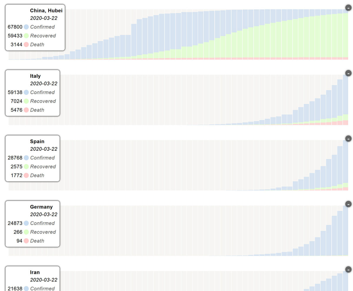
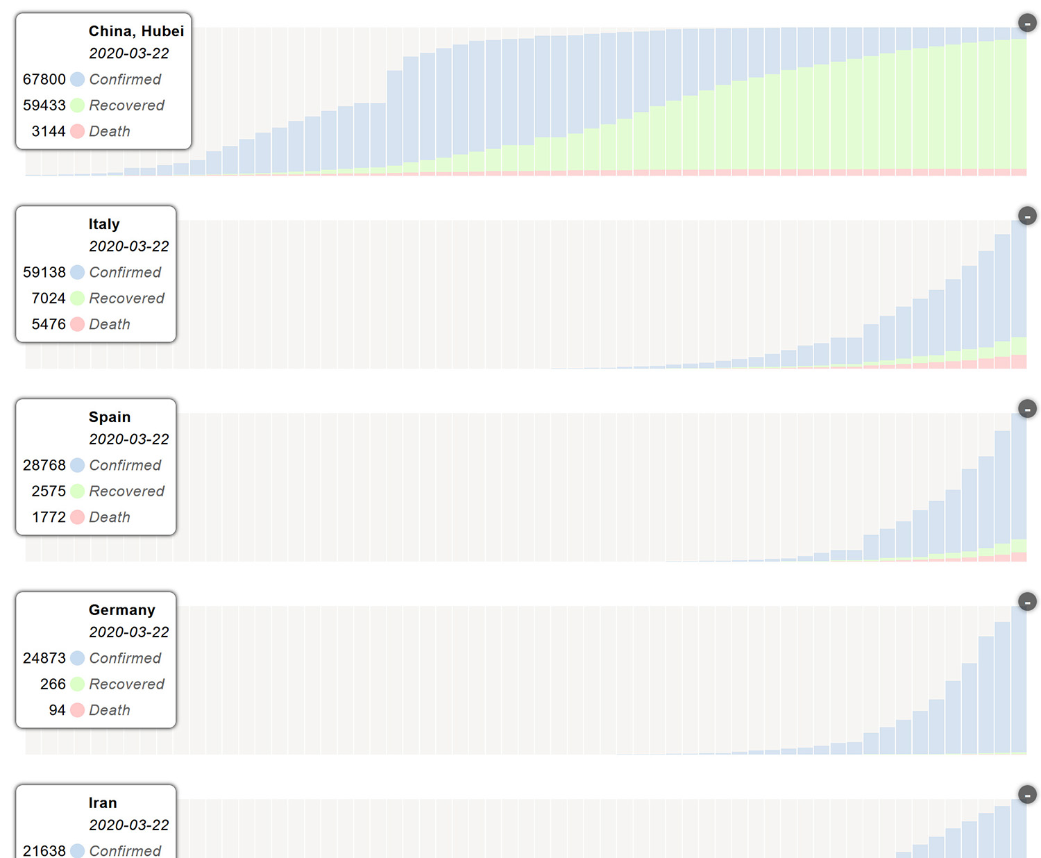
We have added a new view, charts, which should help to better understand the dynamics of development at each location. These diagrams are scaled to facilitate comparative reading – they do not allow quantitative comparisons in any way.
Data collected and managed by Center for Systems Science and Engineering (CSSE) at John Hopkins University – Great Work! https://url.iidj.net/arcgis_75MX
Andreas Schneider
Institute of Information Design Japan iidj
2020-03-23.