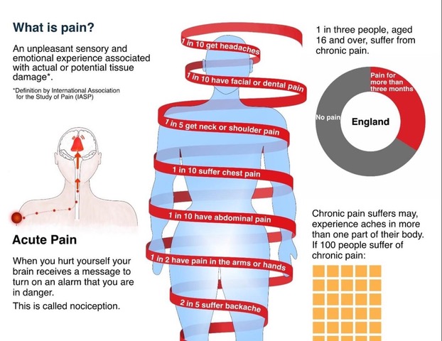
Rita Giordano wrote about the process of developing visualisations about pain. She describes how infographics could be transformed to better reflect patients’ needs.
A quote: ‘We need to be careful about how we display the information and communicate clearly with plain language while avoiding jargon. More importantly, we need to involve patients; their input is critical in shaping the final product. As information designers, we need to not only understand how patients understand visual information, but also how they respond to it emotionally.’
The article concludes:
Never assume. Always ask for feedback. Many people are willing to help.
Engaging patients in your healthcare project will be rewarding.
Ask medical experts for their thoughts and insights into the scientific findings.
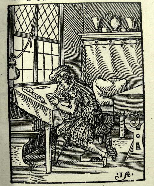
This book applies information design to the understanding of woodcuts. Free download.
This book applies insights from information design to the interpretation of images in woodcut-illustrations.
The study by Andrea van Leerdam shows how woodcuts in vernacular books on medicine and astrology fulfilled important rhetorical functions in knowledge communication. These images guide readers’ perceptions of the organisation, visualisation, and reliability of knowledge.
From the introduction: ‘I draw on ideas on visual rhetoric from the field of information design studies, as outlined below. This field shares with book history the foundational assumption that materiality affects meaning. Choices in design always reflect assumptions held implicitly or explicitly by the designers on how a message can be conveyed effectively.’
Page 35: ‘Ideas from information design studies contribute to a more systematic understanding of the concept. The practical outlook of this field – which design solutions work well under what circumstances, and why? – is instrumental for book historians to work the other way around, as we might say: to reconstruct the possible ways in which early modern book design made meaning.’
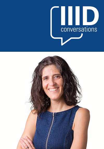
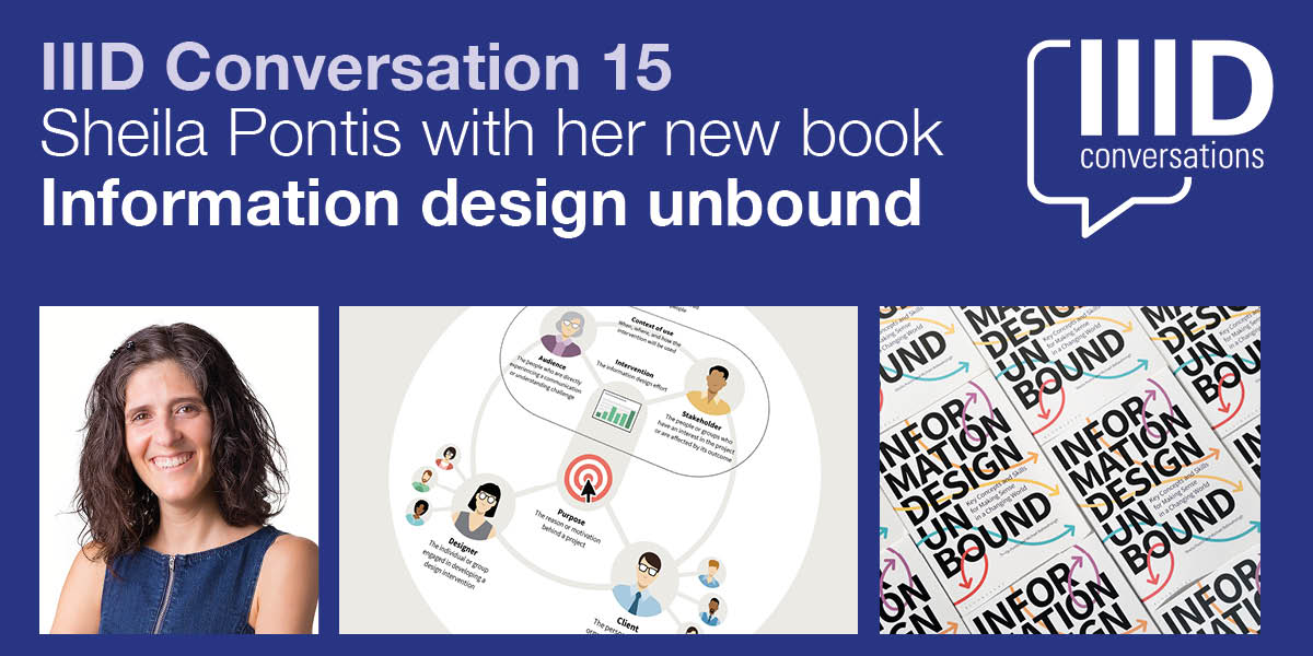
Sheila Pontis will introduce and talk about her new book.
Join us for the next in our series of IIID Conversations. Sheila Pontis will discuss her new book, Information Design Unbound. It’s an important new resource about the theory and practice of information design.
As the complexity of problems facing people, organizations, and the planet grows, the role of information design is more important than ever. Infographics, data visualizations, and other well-known artifacts are part of a broader suite of information design interventions that help promote clarity and understanding.
For designers to realize the full potential of information design in the face of new and ambiguous challenges, they need to build on traditional practices as well as integrate emerging approaches.
Sheila says ‘As the complexity of problems facing people, organizations, and the planet grows, the role of information design is more important than ever. Infographics, data visualizations, and other well-known artifacts are part of a broader suite of information design interventions that help promote clarity and understanding.’
Information Design Unbound: Key Concepts and Skills for Making Sense in a Changing World’ provides a comprehensive introduction to the field. The emphasis is on developing essential strategic thinking and visual problem-solving capabilities. It is written and designed with students’ needs in mind. This book brings information design fundamentals to life. It includes exercises to allow students to put lessons directly into practice. Many case studies demonstrate how information designers think and work, and generous illustrations clarify concepts in a visually engaging way.
Sheila Pontis is an information designer, researcher, educator, and partner at Sense Information Design. With more than 20 years in higher education, her courses and research blend information design, cognitive science, and field research with creative thinking to help people reconnect with their imagination, envision new realities, and feel empowered to lead change — in their own lives and in society. .
Her research has been published in numerous peer-reviewed journals and presented at multiple conferences. She is author of Making Sense of Field Research: A Practical Guide for Information Designers (Routledge, 2018) and coauthor of Communicating Knowledge Visually: Will Burtin’s Scientific Approach to Information Design with R. Roger Remington (RIT Press, 2021). Sheila has a degree in Graphic Design from the University of Buenos Aires, Postgraduate and MPhil degrees from the University of Barcelona, and a PhD from the University of the Arts London.
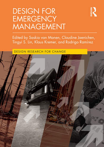
A new book about the critical role and relationship between design and emergencies.
From the publisher: ‘This book highlights the urgency of ensuring that a wide range of stakeholders and a diverse representation of the public comes together to work towards preventing disasters. It contributes methods to actively engage communities in managing and minimizing disaster risk such as earthquakes, hurricanes, flooding and (wild) fires.’
Editors: Saskia van Manen, Claudine Jaenichen, Tingyi S. Lin, Klaus Kremer, Rodrigo Ramírez.
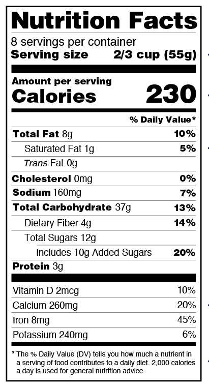
The label was introduced in 1994 in the USA and revised in 2016.
Burkey Belser designed the USA-nutrition label in 1994. It was updated in 2016.
Similar to many other iconic information design objects, Burkey Belser was never paid. The importance of these nutrition facts labels cannot be underestimated.
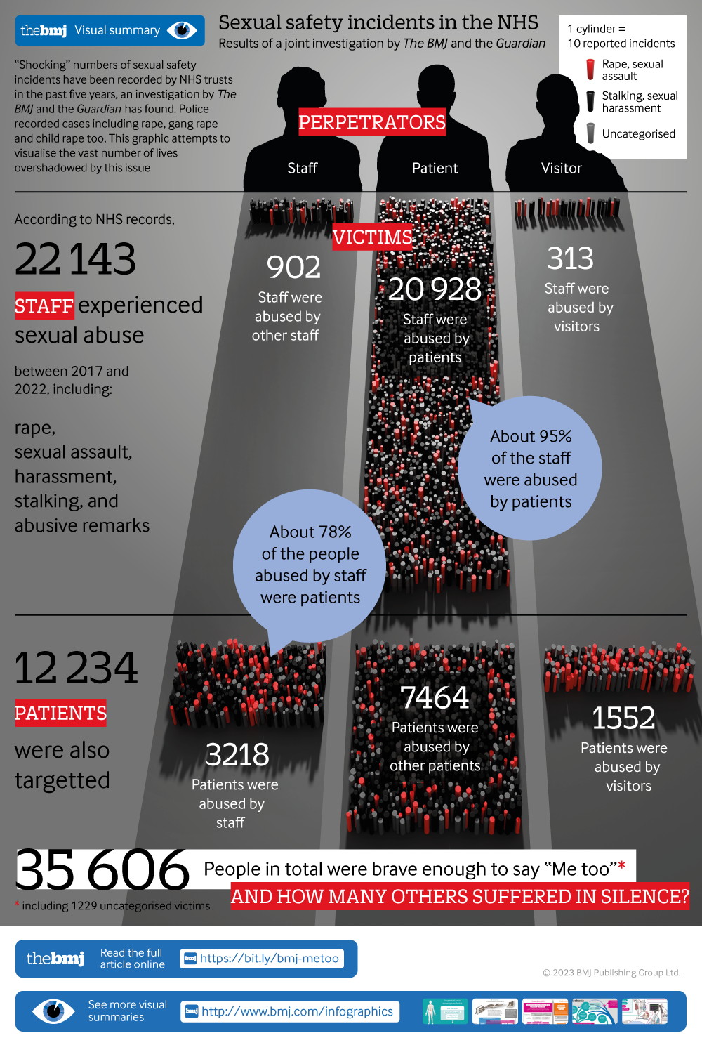
The article describes the considerations that go into the development of a visual to show ‘35,000 recorded cases of rape, sexual assault, harassment, stalking, and abusive remarks between 2017 and 2022 in health facilities run by the UK’s NHS (National Health Service)’.
The article concludes: ‘There are no hard rules, no correct answers. … There is always a healthy dose of personal judgment that is needed to find the right balance and there are plenty of individual decisions to make about scales and formats, which will depend on the project being worked on.’
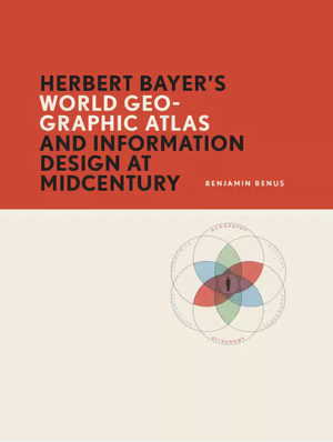
From the publisher: ‘Between 1947 and 1953, the Austrian-born, Bauhaus-trained artist Herbert Bayer (1900–1985) oversaw the design and production of the World Geo-Graphic Atlas, a landmark work of graphic design and data visualization. Benjamin Benus tells the story behind this work’s creation. Benus’s account reconstructs the working methods and intellectual exchanges through which Bayer and his circle of scientific collaborators realized this remarkable work.
A conference about warnings. 11-13 September 2023, London, UK.
This 3-day international conference aims to generate a better understanding of effective warnings. It will be held in person, with some virtual capacity, at UCL in London.
This conference offers research knowledge and skills from within academia, alongside lessons from the many stakeholders we work with. We explore the creation and implementation of warnings, as well as how they can be effective, inclusive, sustainable and people-centred.
We aim to help bridge research, action, and policy to help support the Early Warnings For All initiative alongside UN Sendai Target G, and the International pandemic agreement (WHO CA+).
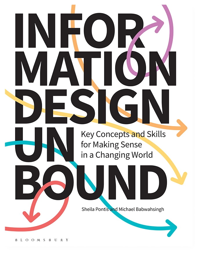
A new book by Sheila Pontis and Michael Babwahsingh can be pre-ordered.
Sheila Pontis and Michael Babwahsingh wrote ‘Information Design Unbound. Key Concepts and Skills for Making Sense in a Changing World.’
The publisher states: ‘Information Design Unbound helps beginning designers build the mindset and skillset to navigate visual communication challenges wherever they may arise.
Written and designed with students’ needs in mind, this book brings information design fundamentals to life: exercises allow students to put lessons directly into practice, case studies demonstrate how information designers think and work, and generous illustrations clarify concepts in a visually engaging way.’
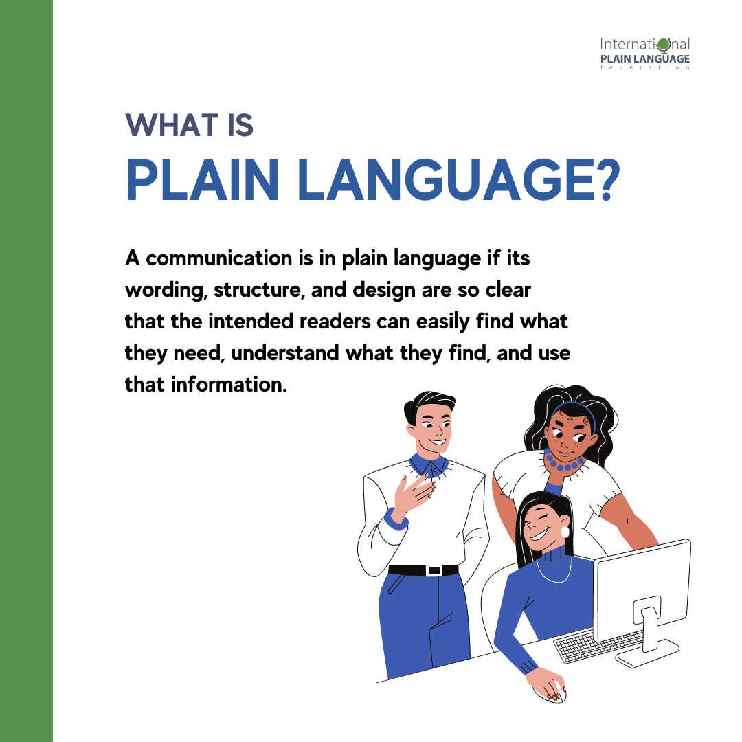
On June 21, ISO published standard 24495-1: 2023: Plain Language – Part 1: Governing principles and guidelines.
The standard aims to: ‘help authors develop documents that communicate effectively with their intended readers’. It explains how four governing principles – relevance, findability, understanding, and usability – can be achieved. The first part of the standard is available for free. The main part needs to be purchased.
IIID participated as a liaison organisation in the writing of this standard.
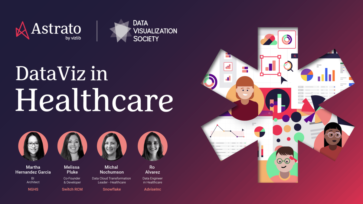
A 45-minute webinar about data visualisation in the healthcare industry.
Join us for DataViz in Healthcare, featuring a panel of expert speakers including:
Melissa Pluke (SwitchRCM’s Co-Founder and developer),
Martha Hernandez Garcia (North Georgia Healthcare Systems’ BI Architect),
Ro Alvarez (AdviseInc’s Data Engineer),
Michal Nochumson (Snowflake’s Data Cloud Transformation Leader).
During this 45-minute webinar our speakers will share their invaluable experiences working in data viz within the healthcare industry, look back on their professional journeys, and showcase the game changing tools, mentors, and lessons that have revolutionized their careers!
Visualizing Complexity Science Workshop by Paul Kahn and Liuhuaying Yang (Vienna, August 28- September 1)
Paul Kahn and Liuhuaying Yang offer a 5-day workshop on Visualising Complexity Science.
The Visualizing Complexity Science Workshop brings together multiple perspectives in information design and data visualization to create complexity science visualizations. Teams will combine researchers together with data visualization designers, data journalists, and data artists engaged in advanced visualization projects.
The program is designed to be diverse, creative and inspiring, offering a mix of lectures by the hosts, invited guest speakers from the international data journalism and visualization community, group discussions, and hands-on working sessions engaging with complexity science research datasets.
Location: Complexity Science Hub, Vienna, Austria
Dates: Monday August 28 – Friday September 1, 2023
After two years online, the Information Design Summer School is face-to-face again – for three intensive days of expert talks, discussion and practical work.
After two years online, the Information Design Summer School is face-to-face again – for three intensive days of expert talks, discussion and practical work in Vienna, just before Vision Plus XIX. There are sessions on design critiquing, visualisation, typography, language and design, iconography, and user testing.
It costs £250, and there are various discounts available. You can find out more at: The Simplification Centre
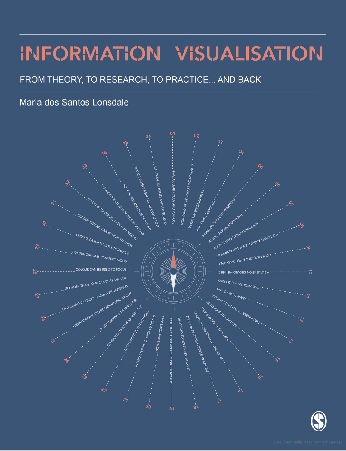
New book by Maria dos Santos Lonsdale about ‘Information Visualisation’.
The publisher states: ‘In a world of information overload, this book will help you to cut through the noise and communicate information with clear, efficient, and engaging visualisations.
This book:
• Explains the principles behind information visualisation, including the science of visual perception and cognition • Provides guidelines that bring research and best practice together • Showcases a range of examples, and outlines the do’s and don’ts of different approaches • Shows how to use research methods to design with and for your target audience.
From an expert with years of experience researching, teaching, and doing information visualisation, learn how to make better and informed decisions around visualisation design that are appropriate for both your data and audience.’