Visualising chronic pain.

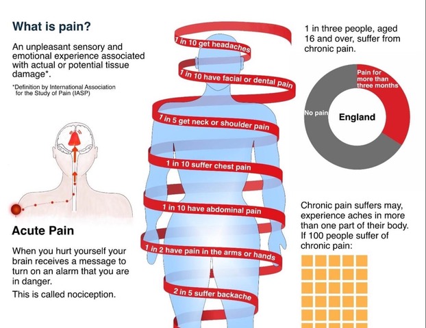
Rita Giordano visualised pain and wrote about it.

Rita Giordano wrote about the process of developing visualisations about pain. She describes how infographics could be transformed to better reflect patients’ needs.

A quote: ‘We need to be careful about how we display the information and communicate clearly with plain language while avoiding jargon. More importantly, we need to involve patients; their input is critical in shaping the final product. As information designers, we need to not only understand how patients understand visual information, but also how they respond to it emotionally.

The article concludes:

  1. Never assume. Always ask for feedback. Many people are willing to help.
  2. Engaging patients in your healthcare project will be rewarding.
  3. Ask medical experts for their thoughts and insights into the scientific findings.

Website of the author: Rita Giordano

Website: Infogr8

Article in ‘Nightingale’

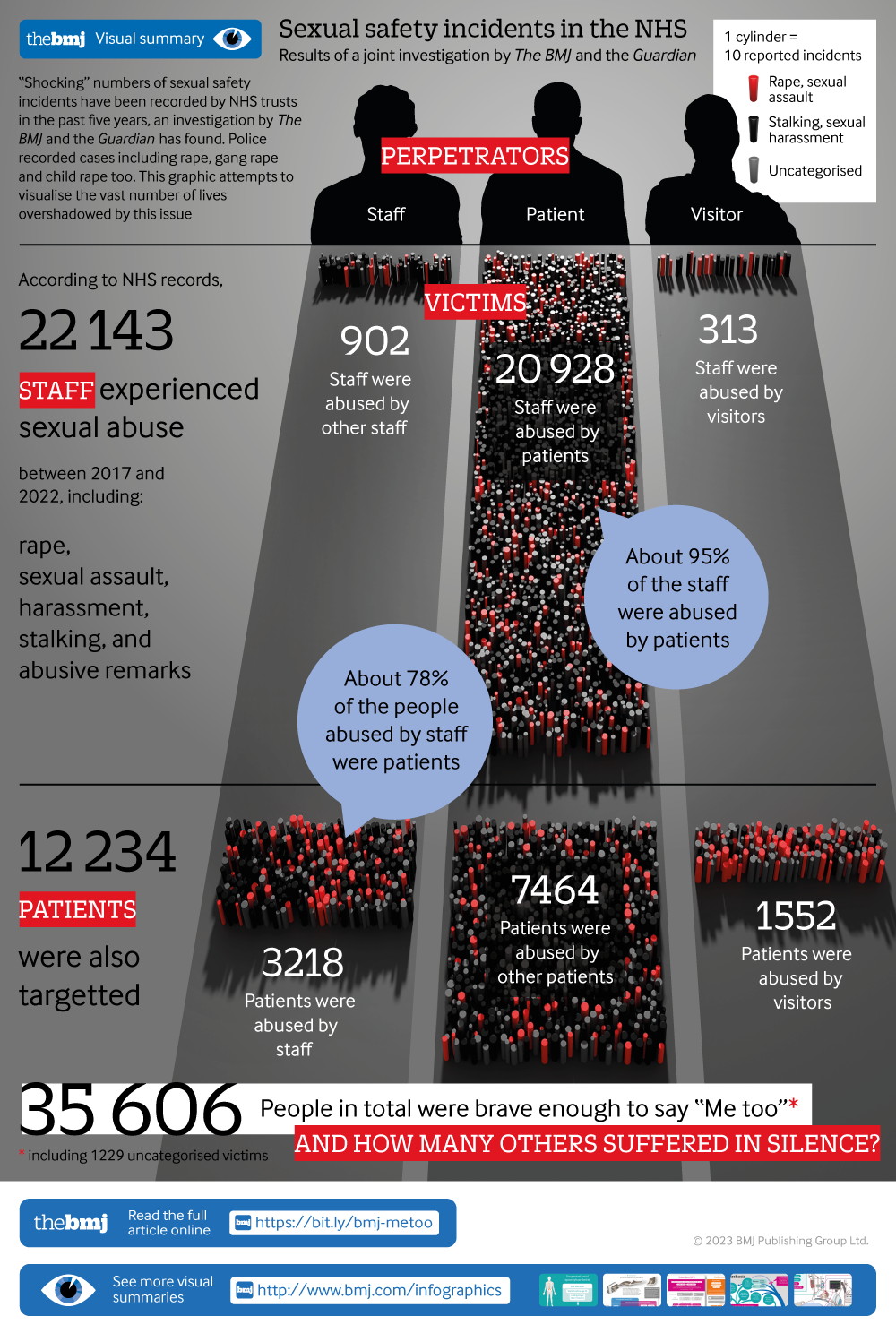
A case study about the visualisation of a large data set.

An article by Will Stahl-Timmins and Nadieh Bremer ‘Showing Human Stories Behind Data Points’ has just been published in Nightingale.

The article describes the considerations that go into the development of a visual to show ‘35,000 recorded cases of rape, sexual assault, harassment, stalking, and abusive remarks between 2017 and 2022 in health facilities run by the UK’s NHS (National Health Service)’.

The article concludes: ‘There are no hard rules, no correct answers. … There is always a healthy dose of personal judgment that is needed to find the right balance and there are plenty of individual decisions to make about scales and formats, which will depend on the project being worked on.’

Conference: Creating Effective Warnings for All

A conference about warnings. 11-13 September 2023, London, UK.

This 3-day international conference aims to generate a better understanding of effective warnings. It will be held in person, with some virtual capacity, at UCL in London.

This conference offers research knowledge and skills from within academia, alongside lessons from the many stakeholders we work with. We explore the creation and implementation of warnings, as well as how they can be effective, inclusive, sustainable and people-centred.

We aim to help bridge research, action, and policy to help support the Early Warnings For All initiative alongside UN Sendai Target G, and the International pandemic agreement (WHO CA+).

Dates: 11- 13 September 2023

Programme: Preliminary version.

Location: UCL Institute for Child Health, 30 Guilford Street, London WC1N 1EH 

Nightingale, the journal of the Data Visualization Society

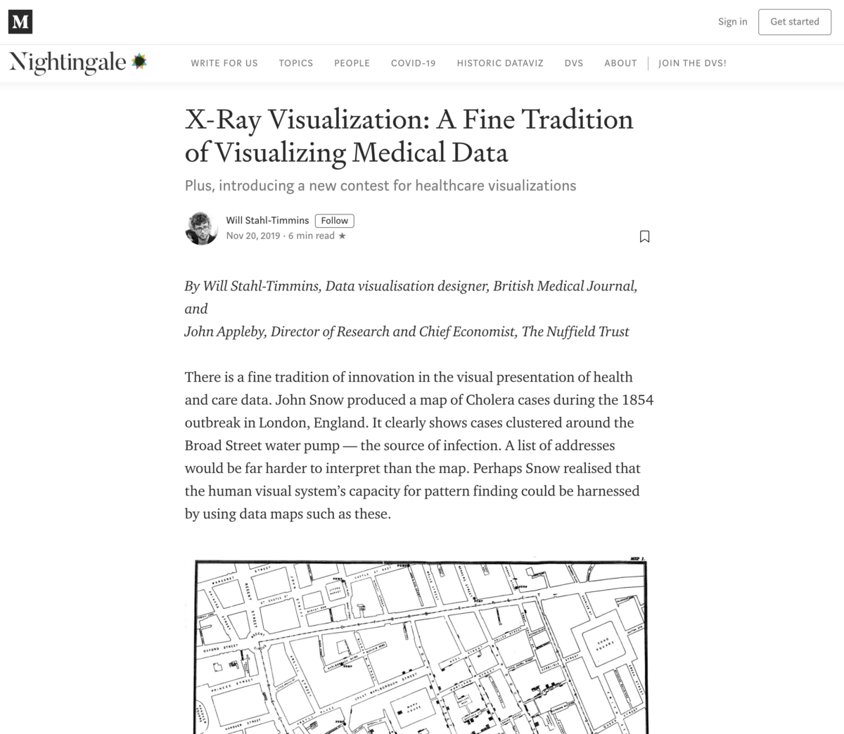
X-Ray Visualization: A Fine Tradition of Visualizing Medical Data – Plus, introducing a new contest for healthcare visualizations.

X-Ray Visualization: A Fine Tradition of Visualizing Medical Data – Plus, introducing a new contest for healthcare visualizations.

By Will Stahl-Timmins, Data visualisation designer, British Medical Journal, and John Appleby, Director of Research and Chief Economist, The Nuffield Trust

There is a fine tradition of innovation in the visual presentation of health and care data. John Snow produced a map of Cholera cases during the 1854 outbreak in London, England. It clearly shows cases clustered around the Broad Street water pump — the source of infection. A list of addresses would be far harder to interpret than the map. Perhaps Snow realised that the human visual system’s capacity for pattern finding could be harnessed by using data maps such as these.

https://medium.com/nightingale/x-ray-visualization-a-fine-tradition-of-visualizing-medical-data-bd9cad58d884
Contribution from WRR, Will Stahl-Timmins

The BMJ (British Medical Journal)

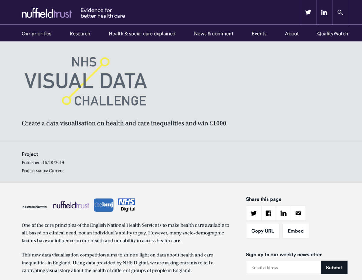
Visualising health inequalities—Announcing a new data visualisation competition in healthcare. Given the ubiquity of data in our lives it is perhaps unsurprising that methods to help us understand this rising tide of digits have become increasingly popular.

Visualising health inequalities—Announcing a new data visualisation competition in healthcare.

Given the ubiquity of data in our lives it is perhaps unsurprising that methods to help us understand this rising tide of digits have become increasingly popular.12 Techniques such as bar and line charts have helped us to see patterns in numerical data since at least the late 18th century.3 However, the digital revolution has boosted the possibilities for visualising data, and there is now a thriving field of practice and research in “data visualisation.”

https://www.bmj.com/content/367/bmj.l5976?
Contribution from WRR, Will Stahl-Timmins

Summer school

Information Design Summer School

Tutors Rob Waller, Clive Richards and Karel van der Waarde

It’s an intense and exciting introduction to the field, and attracts many people who are not from an information design background, but who have problems they think information design can solve. 
We’ve had medical people, lawyers, technical writers and government administrators, for example.

The summer school is taking a break in 2020 but get in touch to find out about our future plans.