Information+ has been postponed for one year, until fall 2021.
Hopefully, in the fall of 2021, a new version of the conference at Georgia Tech will be carried out with as many of the existing components as possible.
There is one positive update: the special issue of the Information Design Journal with contributions by presenters of Information+ 2018 is now finally online under an open access license: https://benjamins.com/catalog/idj.25.1
Extraordinary times require extraordinary measures. Under the given circumstances we have made some changes and adaptations.
Extraordinary times require extraordinary measures. Under the given circumstances we have made some changes and adaptations.
The jury meeting is postponed to May 15/16, will be held face-2-face or online, depending on current developments.
The category “emergency” is dedicated to covid-related entries for only 30,- euro each.
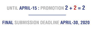
Until April-15, there is a 2+2=2 promotion.
The final deadline for submissions is April-30.
Awarded projects will be announced on May-19.
The IIIDaward-book will be thicker than ever.
The IIIDaward exhibition tour will be expanded to as many as possible places.
Let us show the world the impact of excellent information design. If you have any further suggestions, ideas, please contact us.
The more, the better: our ambition is to have as many cases as possible giving evidence of the importance and relevance of information design. So please submit two entries and get two more for free. Promotion ends on Wed. -15th of April.
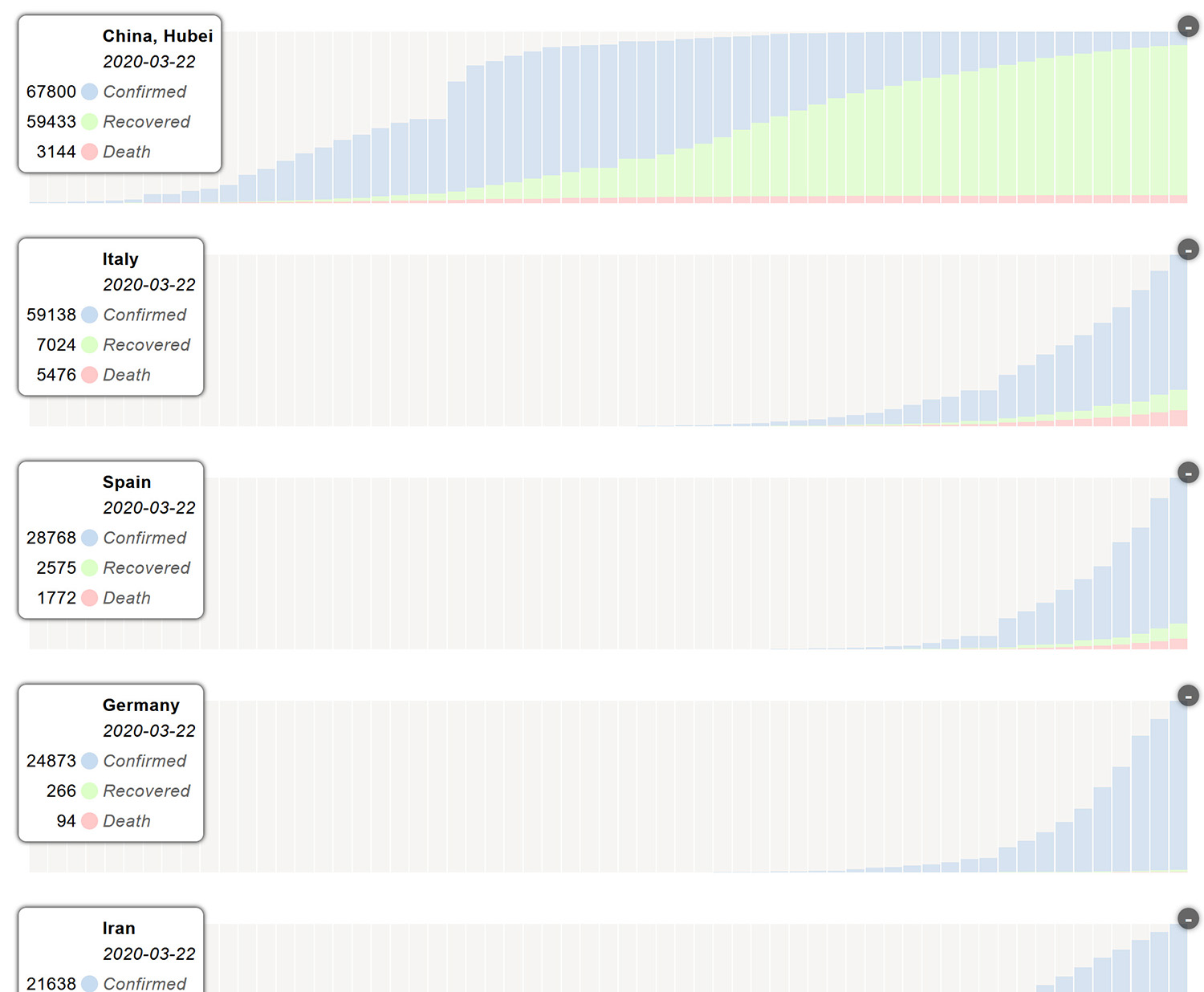
Although we are constantly updating and expanding our visualizations around the developments of the spread of the Corona virus, we are painfully aware of the underlying limitations and the risks of statistical communication.
Although we are constantly updating and expanding our visualizations around the developments of the spread of the Corona virus, we are painfully aware of the underlying limitations and the risks of statistical communication. Numbers, exuding a certain authority, may draw attention in ways that are not appropriate to the issues they claim to represent.
While it is extremely important to put quantitative information in context, we lack the detail to do so in a meaningful way: the number of tests performed, population, demographic profiles and many others.
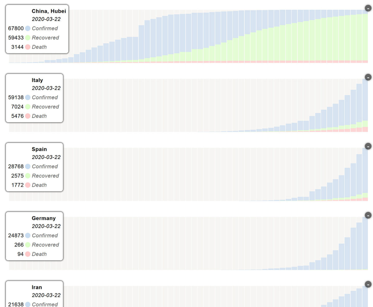
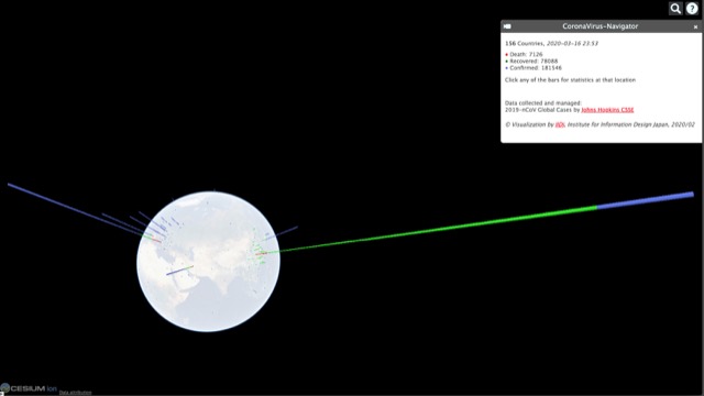
We have added a new view, charts, which should help to better understand the dynamics of development at each location. These diagrams are scaled to facilitate comparative reading – they do not allow quantitative comparisons in any way.
We have added a new view, Charts, which should help to better understand the dynamics of development at each location. These diagrams are scaled to facilitate comparative reading – they do not allow quantitative comparisons in any way. https://api.iidj.net/cv/charts
Data collected and managed by Center for Systems Science and Engineering (CSSE) at John Hopkins University – Great Work! https://url.iidj.net/arcgis_75MX
Andreas Schneider Institute of Information Design Japan iidj 2020-03-23.
Abstract submission deadline has been extended, we are currently working on a new timeline.
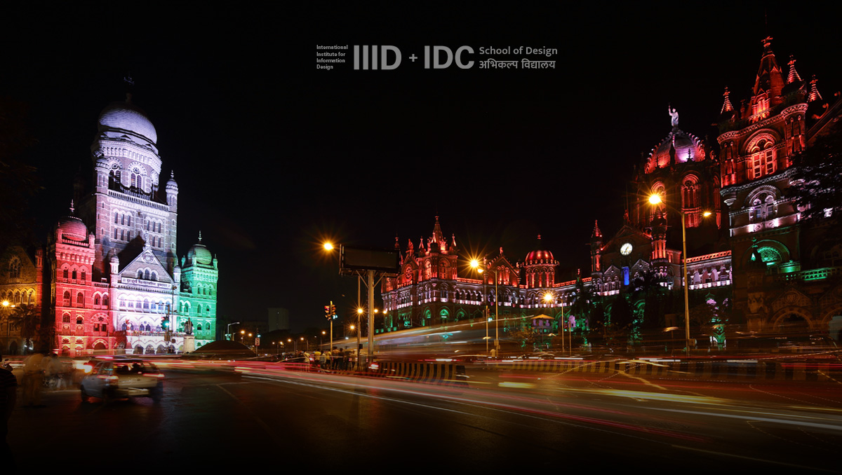
Navigating the City 2020 in Mumbai
Information and mobility design for high-density multilingual environments 6-8 November 2020, Mumbai, India Abstract submission deadline has been extended, we are currently working on a new timeline.
Our aim is to make sure that the event will take place, either in Mumbai or as a virtual conference.
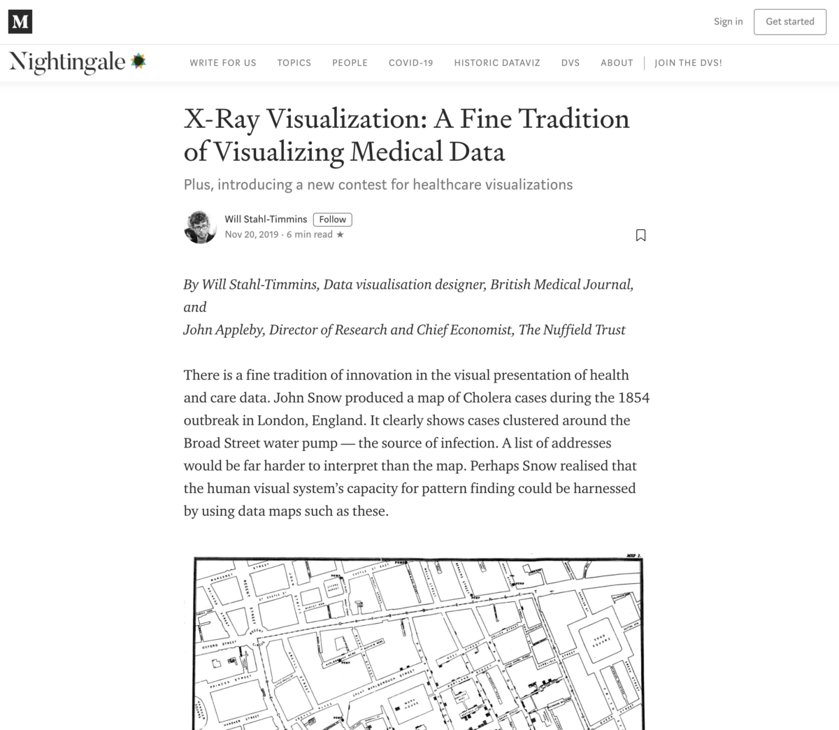
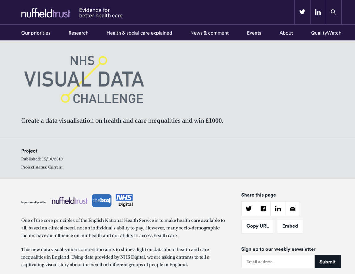
X-Ray Visualization: A Fine Tradition of Visualizing Medical Data – Plus, introducing a new contest for healthcare visualizations.
X-Ray Visualization: A Fine Tradition of Visualizing Medical Data – Plus, introducing a new contest for healthcare visualizations.
By Will Stahl-Timmins, Data visualisation designer, British Medical Journal, and John Appleby, Director of Research and Chief Economist, The Nuffield Trust
There is a fine tradition of innovation in the visual presentation of health and care data. John Snow produced a map of Cholera cases during the 1854 outbreak in London, England. It clearly shows cases clustered around the Broad Street water pump — the source of infection. A list of addresses would be far harder to interpret than the map. Perhaps Snow realised that the human visual system’s capacity for pattern finding could be harnessed by using data maps such as these.
Visualising health inequalities—Announcing a new data visualisation competition in healthcare. Given the ubiquity of data in our lives it is perhaps unsurprising that methods to help us understand this rising tide of digits have become increasingly popular.
Visualising health inequalities—Announcing a new data visualisation competition in healthcare.
Given the ubiquity of data in our lives it is perhaps unsurprising that methods to help us understand this rising tide of digits have become increasingly popular.12 Techniques such as bar and line charts have helped us to see patterns in numerical data since at least the late 18th century.3 However, the digital revolution has boosted the possibilities for visualising data, and there is now a thriving field of practice and research in “data visualisation.”
Andreas Schneider from IIDj, Institute for Information Design Japan sent this article.
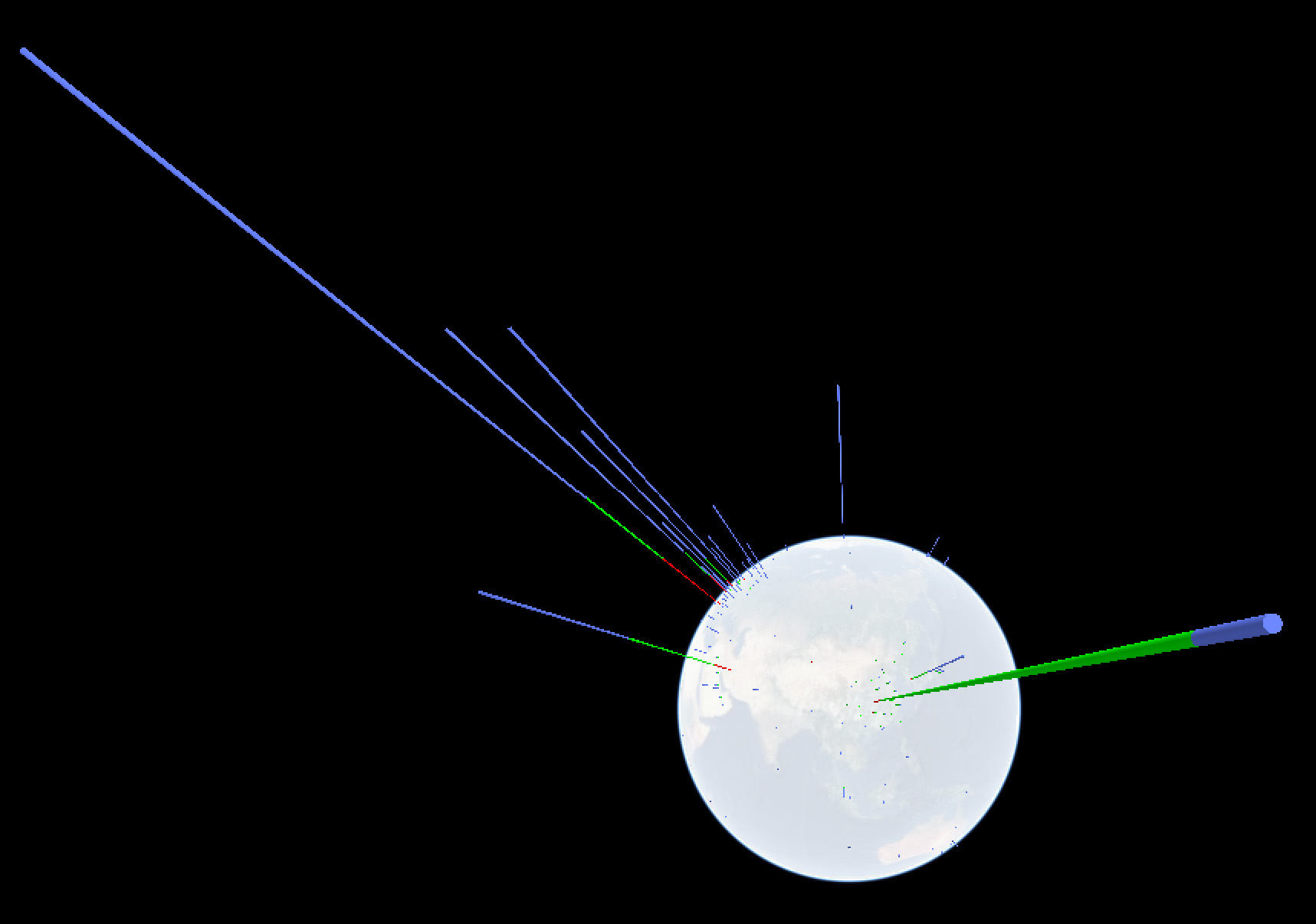
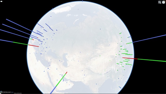
Corona virus navigator: IIDj keeps a live 3-D visualization of the virus’ geographic appearance within the limitations set by insufficient data, based on the LiveTracker of the Center for Systems Science and Engineering (CSSE) at John Hopkins University, US
Following the development of presentations around the coronavirus evolution we feel obliged to raise our concerns:
Numbers are only meaningful if they refer to a known metric – the sum of the identified infections must be reported together with the total number of persons testedpresentations have to consider and communicate three phases: IDENTIFICATION, RECOVERY, FATALITIES.
Data should be provided by SITES, identifiable significant agglomerations / communities – and not by arbitrary political entities – such as province or country.
The number of cases cannot be visualized as blobs of varying size on 2-dimensional maps, giving the impression of a geographical spread when the underlying data is the total within an arbitrary political boundary – such as province or country.
Color schemes should enable understanding rather than cause fear.
AUTHORSHIP/SOURCE of data/information used must be clearly stated, including contact details for questions and feedback.
We keep updating the live 3-D visualization of the virus’ geographic appearance within the limitations set by insufficient data, based on the LiveTracker of the Center for Systems Science and Engineering (CSSE) at John Hopkins University, USA. https://api.iidj.net/cv/ https://api.iidj.net/cv/timeline
We hope that the respective authorities will make efforts to provide appropriate data in a consistent format. This is necessary for responsible decision-making at personal and political levels that can count on the understanding of all concerned.
Data collected and managed by Center for Systems Science and Engineering (CSSE) at John Hopkins University. https://url.iidj.net/arcgis_75MX
Context, worldwide: According to WHO, 15 deaths every minute = 8MIO per year through AIR POLLUTION https://url.iidj.net/who_ghZS According to WHO, 15+ deaths every minute = 8MIO+ per year through TOBACCO USE https://url.iidj.net/who_7745 According to WHO, 3 deaths every minute = 1.6MIO per year directly caused by DIABETES (2016) https://url.iidj.net/who_HL21
September 30th – October 2nd 2020 The Watergate Hotel, Washington, USA
Clarity 2020 focuses on Access for All to include access for any person to justice systems, health-care choices, financial decisions, opportunities, technology, and much more.
This one-day conference VK20 questions how we can make democracy more visual, and thereby, enabling more people to be informed participants in democracy.
15 categories, entries from around the world, an international jury, and a great track record for high quality competition. We don’t just give it away, folks! Entry deadline: 18 March 2020 Be a winner
2019 Christian Lunger and Markus Scheiber started a series of (mainly German) conversations about orientation, spacial design, and information. Well worth listening to!
Tutors Rob Waller, Clive Richards and Karel van der Waarde
It’s an intense and exciting introduction to the field, and attracts many people who are not from an information design background, but who have problems they think information design can solve. We’ve had medical people, lawyers, technical writers and government administrators, for example.
The summer school is taking a break in 2020 but get in touch to find out about our future plans.