Book: Will Burtin’s Scientific Approach to Information Design.

In their new book, “Communicating Knowledge Visually: Will Burtin’s Scientific Approach to Information Design”, R. Roger Remington and Sheila Pontis, reveal the life, work, and mindset of Will Burtin.

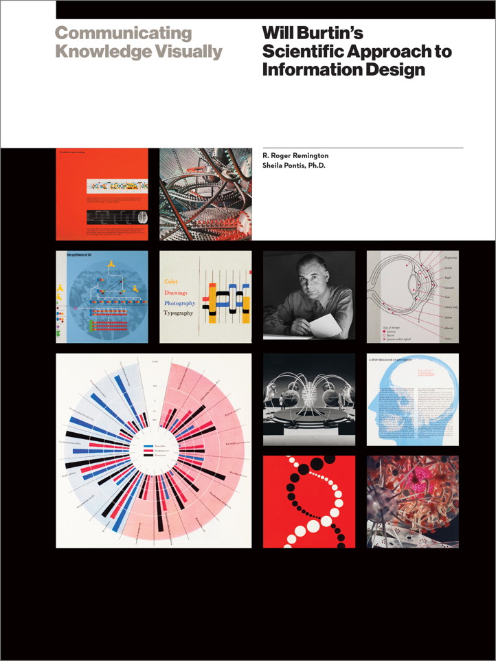
This book presents a timely, in-depth examination of Will Burtin, a pioneer of information design. Using a methodical approach, the authors, R. Roger Remington and Sheila Pontis, analyze Burtin’s way of working, and nine of his seminal projects, including his exhibitions for The Upjohn Company, and diagrams for their SCOPE magazine.

Excerpts taken from Burtin’s unpublished writing offer insight into his thinking process and explain how he transformed complex scientific information into easy, accessible visual forms. Scientists, designers, educators and students will gain valuable knowledge from Burtin’s unique design approach in meeting the current challenges of communicating complexity in their respective fields.

Website: https://www.willburtin.com/

Publisher and ordering: https://www.rit.edu/press/communicating-knowledge-visually

Book launch: December 13, 2021. A recording of this launch can be seen at YouTube.

Conference: ICTVC, Thessaloniki: 5-9 July 2022

The conference theme for ICTVC 8 is ‘Beyond the obvious: Typography and Visual Communication in times of disruption’.

Conference website: https://ictvc.org/2022/en/

Call for papers: https://easychair.org/cfp/8th_ICTVC

Deadline for submissions: January 16, 2022.

‘It is obvious that the pandemic affects our daily lives and the way we operate as educators, students or practitioners in the fields of typography and visual communication. The aim of the conference is to ‘see’ beyond the obvious, discussing examples from the past, deepening into the present, and raising important issues for the future in the areas of history, theory and practice. Among the plans of the Organizing Committee of the 2022 ICTVC is to have a special section on education, the challenges and opportunities in turbulent and uncertain times like these.’

Job: Assistant professor: Information Design & Data Visualization

Northeastern University invites applications and nominations for tenure-track appointment at the rank of Assistant Professor in the field of data visualization.

Ideal candidates will be accomplished designers and researchers in graphic/information design and data visualization with interest and expertise in data driven design processes.

Location: Boston Main Campus.

Dates: Applications received before January 10, 2022 will be guaranteed full review and consideration. The position will remain open until filled. Preferred start date is for the 2022-2023 academic year.

Inquiries may be directed to Professor Enrico Bertini, chair of the search committee: enrico.bertini@gmail.com.

Link: https://careers.hrm.northeastern.edu/en-us/job/508570/assistant-professor-information-design-and-data-visualization

Fall foliage is seen on Centennial Common Sept. 17, 2016. Photo by Matthew Modoono/Northeastern University

Announcing the 54th SDA Award

The Japan Sign Design Association Award (as known as SDA Award) was established in 1966 for the purpose of promoting and educating the public about the sign design through presentation of signature design works to the wide society.

The Japan Sign Design Association Award (as known as SDA Award) was established in 1966 for the purpose of promoting and educating the public about the sign design through presentation of signature design works to the wide society.

It continues to be the only award program for sign design in Japan. Signs today are considered as an interface that connects urban space or corporate activities with consumers, or as information that is indispensable for revitalizing the environment and establishing communication, and their examples are seen with more diverse variations.

The Japan Sign Design Association invites applications for awards from signature design works with high quality.

Information, registration and more on the SCA Award website.

Information+ Conference postponed to 2021

Information+ has been postponed for one year, until fall 2021.

Hopefully, in the fall of 2021, a new version of the conference at Georgia Tech will be carried out with as many of the existing components as possible.

There is one positive update: the special issue of the Information Design Journal with contributions by presenters of Information+ 2018 is now finally online under an open access license: https://benjamins.com/catalog/idj.25.1

Changes to IIIDaward 2020

Extraordinary times require extraordinary measures. Under the given circumstances we have made some changes and adaptations.

Extraordinary times require extraordinary measures. Under the given circumstances we have made some changes and adaptations.

The jury meeting is postponed to May 15/16, will be held face-2-face or online, depending on current developments.

  • The category “emergency” is dedicated to covid-related entries for only 30,- euro each.
  • Until April-15, there is a 2+2=2 promotion.
  • The final deadline for submissions is April-30.
  • Awarded projects will be announced on May-19.
  • The IIIDaward-book will be thicker than ever.
  • The IIIDaward exhibition tour will be expanded to as many as possible places.

Let us show the world the impact of excellent information design.  If you have any further suggestions, ideas, please contact us.

The more, the better: our ambition is to have as many cases as possible giving evidence of the importance and relevance of information design. 
So please submit two entries and get two more for free.
Promotion ends on Wed. -15th of April.

For details and submissions, please visit the IIIDaward website.

The BMJ (British Medical Journal)

Visualising health inequalities—Announcing a new data visualisation competition in healthcare. Given the ubiquity of data in our lives it is perhaps unsurprising that methods to help us understand this rising tide of digits have become increasingly popular.

Visualising health inequalities—Announcing a new data visualisation competition in healthcare.

Given the ubiquity of data in our lives it is perhaps unsurprising that methods to help us understand this rising tide of digits have become increasingly popular.12 Techniques such as bar and line charts have helped us to see patterns in numerical data since at least the late 18th century.3 However, the digital revolution has boosted the possibilities for visualising data, and there is now a thriving field of practice and research in “data visualisation.”

https://www.bmj.com/content/367/bmj.l5976?
Contribution from WRR, Will Stahl-Timmins