X-Ray Visualization: A Fine Tradition of Visualizing Medical Data – Plus, introducing a new contest for healthcare visualizations.
By Will Stahl-Timmins, Data visualisation designer, British Medical Journal, and John Appleby, Director of Research and Chief Economist, The Nuffield Trust
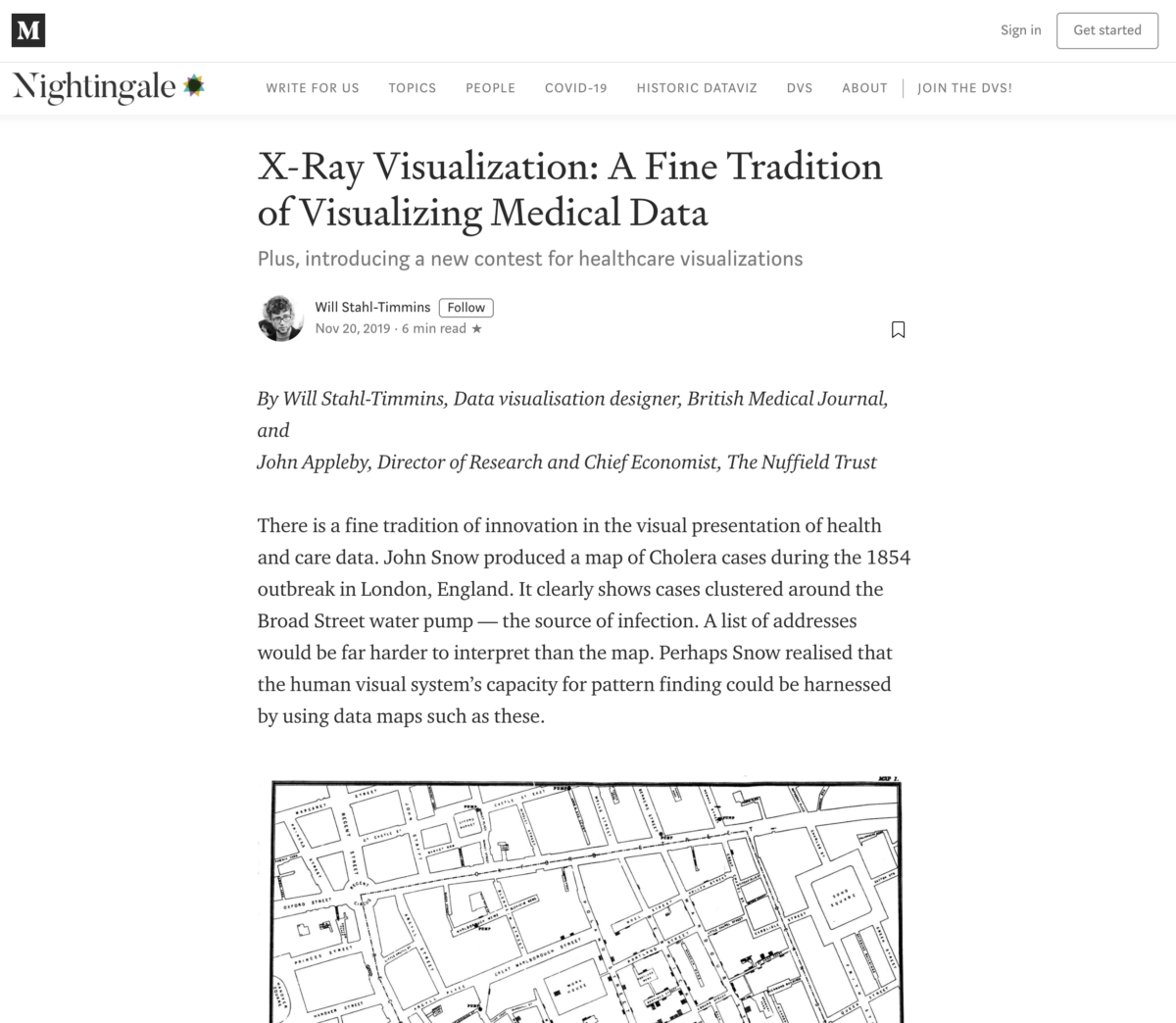
There is a fine tradition of innovation in the visual presentation of health and care data. John Snow produced a map of Cholera cases during the 1854 outbreak in London, England. It clearly shows cases clustered around the Broad Street water pump — the source of infection. A list of addresses would be far harder to interpret than the map. Perhaps Snow realised that the human visual system’s capacity for pattern finding could be harnessed by using data maps such as these.
https://medium.com/nightingale/x-ray-visualization-a-fine-tradition-of-visualizing-medical-data-bd9cad58d884
Contribution from WRR, Will Stahl-Timmins

