The International Institute for Information Design (IIID) is a global network for people who work to make information clearer – for everyday life, business, education and science. It combines graphic design, user experience, plain language, and design research.
- IIID Conversation: Design for Emergency Management, 18 January 2024, 17:00 UTC
This time we delve into the emerging discipline of Design for Emergency Management, where the application of design takes on a comprehensive role in preventing and addressing disasters.
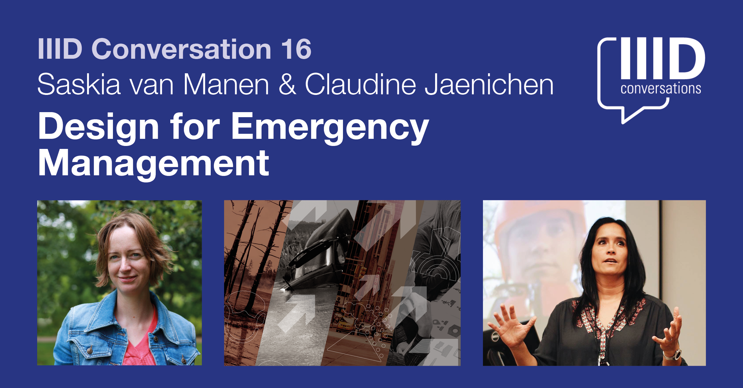
This talk will discuss the distinctions between this emerging discipline and traditional design, and showcase how design methods bring innovative evidence-based perspectives to the complex challenges presented by natural hazards such as earthquakes, hurricanes, flooding, and wildfires. This role extends far beyond aesthetics, and the discussion will underscore the imperative for collaborative endeavors that encompass a variety of stakeholders and ensure inclusive representation.
Saskia and Claudine together with Tingyi S. Lin, Klaus Kremer, Rodrigo Ramírez created the book ‘Design for Emergency Management’ that highlights the design research for change.
From the publisher: ‘This book highlights the urgency of ensuring that a wide range of stakeholders and a diverse representation of the public comes together to work towards preventing disasters. It contributes methods to actively engage communities in managing and minimizing disaster risk such as earthquakes, hurricanes, flooding and (wild) fires.’
Editors: Saskia van Manen, Claudine Jaenichen, Tingyi S. Lin, Klaus Kremer, Rodrigo Ramírez
Publisher: Routledge
Book siteBooking for the IIID Conversation: Eventbrite
Saskia van Manen is co-founder of Design for Emergency Management. She is also a visiting research fellow at the Open University (UK). Saskia has always been fascinated by the power of nature, and volcanoes in particular. As disasters only occur at the interface between nature and society, she has increasingly worked across discipline boundaries. Her interest is in facilitating sustainable and inclusive community-led action on disaster risk reduction, resilience strengthening and climate adaptation through Earth-centered and evidence-based design. She holds a PhD in Volcanology, an MA in Product Design and Innovation and an M.Sci. in Geophysics.

Claudine Jaenichen Claudine Jaenichen specializes in information design, focusing on the interplay between design, cognition, and situational design for cognitively demanding events. She advocates for inclusivity in design, particularly in evacuation information and public information projects, using participatory design and benchmarking to measure success and audience communication. Claudine is actively involved in international design communities, serving on the Executive Board of Directors for the Design Network for Emergency Management and as Vice President of the International Institute of Information Design (IIID). Her work spans various fields including humanities, government, social sciences, and sciences, reflecting her commitment to interdisciplinary engagement and design advocacy.
- Visualising chronic pain.
Rita Giordano wrote about the process of developing visualisations about pain. She describes how infographics could be transformed to better reflect patients’ needs.
A quote: ‘We need to be careful about how we display the information and communicate clearly with plain language while avoiding jargon. More importantly, we need to involve patients; their input is critical in shaping the final product. As information designers, we need to not only understand how patients understand visual information, but also how they respond to it emotionally.’
The article concludes:
- Never assume. Always ask for feedback. Many people are willing to help.
- Engaging patients in your healthcare project will be rewarding.
- Ask medical experts for their thoughts and insights into the scientific findings.
Website of the author: Rita Giordano
Website: Infogr8
- New book: ‘Woodcuts as Reading Guides.’
This book applies insights from information design to the interpretation of images in woodcut-illustrations.
The study by Andrea van Leerdam shows how woodcuts in vernacular books on medicine and astrology fulfilled important rhetorical functions in knowledge communication. These images guide readers’ perceptions of the organisation, visualisation, and reliability of knowledge.
From the introduction: ‘I draw on ideas on visual rhetoric from the field of information design studies, as outlined below. This field shares with book history the foundational assumption that materiality affects meaning. Choices in design always reflect assumptions held implicitly or explicitly by the designers on how a message can be conveyed effectively.’
Page 35: ‘Ideas from information design studies contribute to a more systematic understanding of the concept. The practical outlook of this field – which design solutions work well under what circumstances, and why? – is instrumental for book historians to work the other way around, as we might say: to reconstruct the possible ways in which early modern book design made meaning.’
Webpage: Amsterdam University Press.
Price: Free download / open access.
- AI Unleashed: 27 to 29 November 2023 (hybrid)
Exploring the Frontiers of Artificial Intelligence,
Asian Convergence 2023An excellent opportunity for creative professionals to acquire the most up-to-date AI knowledge. The programme will include keynote presentations, seminars and roundtables, exhibition and sharing programmes with young designers and students.
Jointly organised by The Hong Kong Federation of Design and Creative Industries (FHKDCI), The Design Alliance Asia (tDA Asia) and Hong Kong Design Institute (HKDI).
For details of the event and registration
The event is free of charge.
- IIID Conversation with Sheila Pontis, 7 December 2023, 16:00 UTC
Join us for the next in our series of IIID Conversations. Sheila Pontis will discuss her new book, Information Design Unbound. It’s an important new resource about the theory and practice of information design.
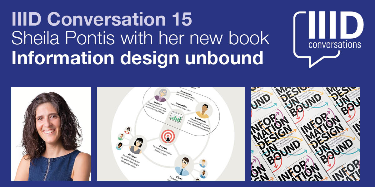
As the complexity of problems facing people, organizations, and the planet grows, the role of information design is more important than ever. Infographics, data visualizations, and other well-known artifacts are part of a broader suite of information design interventions that help promote clarity and understanding.
For designers to realize the full potential of information design in the face of new and ambiguous challenges, they need to build on traditional practices as well as integrate emerging approaches.
Sheila says ‘As the complexity of problems facing people, organizations, and the planet grows, the role of information design is more important than ever. Infographics, data visualizations, and other well-known artifacts are part of a broader suite of information design interventions that help promote clarity and understanding.’
Information Design Unbound: Key Concepts and Skills for Making Sense in a Changing World’ provides a comprehensive introduction to the field. The emphasis is on developing essential strategic thinking and visual problem-solving capabilities. It is written and designed with students’ needs in mind. This book brings information design fundamentals to life. It includes exercises to allow students to put lessons directly into practice. Many case studies demonstrate how information designers think and work, and generous illustrations clarify concepts in a visually engaging way.
Authors: Sheila Pontis & Michael Babwahsingh
Publisher: Bloomsbury Visual Arts, 2023.Booking for the IIID Conversation: Eventbrite

Sheila Pontis is an information designer, researcher, educator, and partner at Sense Information Design. With more than 20 years in higher education, her courses and research blend information design, cognitive science, and field research with creative thinking to help people reconnect with their imagination, envision new realities, and feel empowered to lead change — in their own lives and in society. .
Her research has been published in numerous peer-reviewed journals and presented at multiple conferences. She is author of Making Sense of Field Research: A Practical Guide for Information Designers (Routledge, 2018) and coauthor of Communicating Knowledge Visually: Will Burtin’s Scientific Approach to Information Design with R. Roger Remington (RIT Press, 2021). Sheila has a degree in Graphic Design from the University of Buenos Aires, Postgraduate and MPhil degrees from the University of Barcelona, and a PhD from the University of the Arts London.
- New book: ‘Design for Emergency Management’
From the publisher: ‘This book highlights the urgency of ensuring that a wide range of stakeholders and a diverse representation of the public comes together to work towards preventing disasters. It contributes methods to actively engage communities in managing and minimizing disaster risk such as earthquakes, hurricanes, flooding and (wild) fires.’
Editors: Saskia van Manen, Claudine Jaenichen, Tingyi S. Lin, Klaus Kremer, Rodrigo Ramírez.
Published by: Routledge.
- TEDx talk by Karel van der Waarde
Enabling patients by listening to them
Karel’s TEDx talk “Enabling patients” is published right on time. It highlights some arguments why the European legislation about medicines information in package leaflets needs to be changed.
Fortunately, it is now possible to provide feedback about a proposal for revision of this legislation. The deadline is November 8.
If the proposal is not modified, we’ll continue to have these useless, expensive, unsustainable, and embarrassingly poor leaflets for a few more decades. Patients deserve better.
IIID will provide feedback about the proposed revision to the European Commission.
- Burkey Belser – designer of US- nutrition label – dies at 76
Burkey Belser designed the USA-nutrition label in 1994. It was updated in 2016.
Similar to many other iconic information design objects, Burkey Belser was never paid. The importance of these nutrition facts labels cannot be underestimated.
Obituaries appeared in the Washington Post and Davidson College on September 25. An interview was published in March 2014.
- Article in ‘Nightingale’
An article by Will Stahl-Timmins and Nadieh Bremer ‘Showing Human Stories Behind Data Points’ has just been published in Nightingale.
The article describes the considerations that go into the development of a visual to show ‘35,000 recorded cases of rape, sexual assault, harassment, stalking, and abusive remarks between 2017 and 2022 in health facilities run by the UK’s NHS (National Health Service)’.
The article concludes: ‘There are no hard rules, no correct answers. … There is always a healthy dose of personal judgment that is needed to find the right balance and there are plenty of individual decisions to make about scales and formats, which will depend on the project being worked on.’
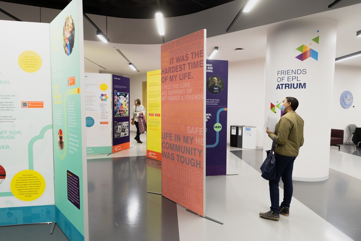
- IIID Conversation with Gillian Harvey, 5 October 2023, 15:00 UTC
Health communications about addiction
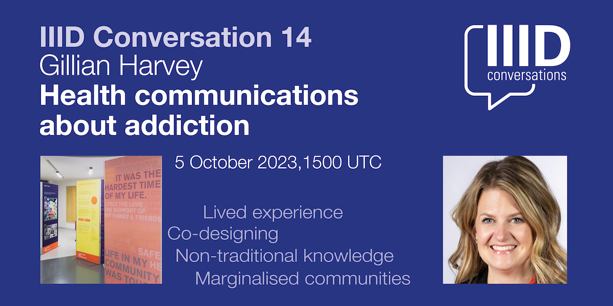
Gillian says “it’s important to engage communities in health system change, particularly for marginalized and equity seeking groups. I will also discuss what types of methods work well, but also what could be improved upon in using co-design”.
Gillian Harvey will discuss two projects designed to increase empathy and reduce stigma toward people who experience addiction. She used co-design methods to learn from lived experience and non-traditional knowledge forms; and she used community-based decision-making aimed at shared ownership of the solutions.

Gillian Harvey Introducing Gillian Harvey
Gillian is an Associate Professor in Design Studies, Department of Art & Design at the University of Alberta (Canada), where she teaches undergraduate students design theory, practice and research. She is Co-Director of the Design Health Research Innovation Lab (DHRIL) and a World Region Representation of the International Institute of Information Design (IIID).
Her research prioritizes information design, design for decision making and design in critical or emergency situations including technical administration of emergency overdose kits, patient safety education materials and pediatric resuscitation. She has worked with government, industry and the private sector developing materials that include projects that address systems concerns, and enhance broader healthcare processes.
- Natural History Museum launches £150,000 wayfinding tender
The Natural History Museum has launched a tender valued at £150,000 for the design of a new signage and wayfinding system.
More information: Delta eSourcing
Deadline to register interest: September 14, 2023.
- New Book: ‘Herbert Bayer’s World Geo-Graphic Atlas and Information Design at Midcentury’
From the publisher: ‘Between 1947 and 1953, the Austrian-born, Bauhaus-trained artist Herbert Bayer (1900–1985) oversaw the design and production of the World Geo-Graphic Atlas, a landmark work of graphic design and data visualization. Benjamin Benus tells the story behind this work’s creation. Benus’s account reconstructs the working methods and intellectual exchanges through which Bayer and his circle of scientific collaborators realized this remarkable work.
Author: Benjamin Benus
A review by Steven Heller in The Daily Heller (July 31, 2023)
Published by: Rochester Institute of Technology, RIT Press.
- Conference: Creating Effective Warnings for All
This 3-day international conference aims to generate a better understanding of effective warnings. It will be held in person, with some virtual capacity, at UCL in London.
This conference offers research knowledge and skills from within academia, alongside lessons from the many stakeholders we work with. We explore the creation and implementation of warnings, as well as how they can be effective, inclusive, sustainable and people-centred.
We aim to help bridge research, action, and policy to help support the Early Warnings For All initiative alongside UN Sendai Target G, and the International pandemic agreement (WHO CA+).
Dates: 11- 13 September 2023
Programme: Preliminary version.
Location: UCL Institute for Child Health, 30 Guilford Street, London WC1N 1EH
- Book: ‘Information Design unbound’
Sheila Pontis and Michael Babwahsingh wrote ‘Information Design Unbound. Key Concepts and Skills for Making Sense in a Changing World.’
The publisher states: ‘Information Design Unbound helps beginning designers build the mindset and skillset to navigate visual communication challenges wherever they may arise.
Written and designed with students’ needs in mind, this book brings information design fundamentals to life: exercises allow students to put lessons directly into practice, case studies demonstrate how information designers think and work, and generous illustrations clarify concepts in a visually engaging way.’
More information on the website of Sheila Pontis.
The book can be pre-ordered from Bloomsbury Publishers.
- Katherine Gillieson
Emily Carr University
Vancouver, CanadaAssociate Dean, Master of Design and Associate Professor, Communication Design
What is the motivation to work in information design?
Information design is at the core of my interests as a design practitioner, researcher and educator. Encompassing principles of accessibility and clear communication alongside ethical and social motivations, I believe that information design techniques and approaches can be generatively applied in various work contexts and in daily life.
What are you working on at the moment?
I am currently managing the graduate programs in interdisciplinary and interaction design at Emily Carr, and working on future program development. I am also working on a number of design and publication projects through the Occasional Press, a publishing research initiative at Emily Carr
What is a project you consider a great example of information design?
I appreciate a good taxonomy or meta-representation of collections or systems relevant to the practice of design itself, for example for types of diagrams (datavizproject, and datavizcatalogue.com for example), or cognitive biases.
The work of Studio Joost Grootens.
What is your dream project?
- Any project involving multiple modalities (publication, UX, exhibition, etc) for a project in education, the cultural sector, climate justice and allied fields, in which I would be involved as a designer from the very beginning.
- Some time to study the archives, notebooks and other documents of the creator of the Sankey diagram, M.H.P.R. Sankey (who was my great-great-grandfather).
- IIID Conversation with Sigitas Gužauskas, 6 July 2023, 15:00 UTC
Data humanisation
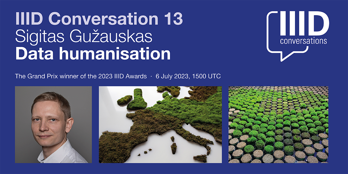
To enhance clarity, information design often simplifies complex real-world phenomena into basic visual representations.
While these graphics are clear, they may not always have the impact needed. Data often contains intriguing narratives and stories that, when uncovered, can be used to create a more engaging and versatile information experience for the audience.
By adding an experiential layer to the dry data, designers can aim to captivate a wider audience and offer a broader range of interpretations.

Introducing Sigitas Gužauskas
Sigitas is a practicing visual communication designer, a researcher, a lecturer and a member of the Lithuanian Design Association. Recently, he completed his doctoral thesis “Explanatory Strategies in Information Design” at Vilnius Academy of Arts.
His research interests focus mainly on information design, exploring images that explain. He designs packaging, exhibitions and infographics, and experiments with information, and data visualizing objects.
Sigitas’ most recent projects are exhibition design for the Energy and Technology Museum (2022), and the Museum of Applied Arts and Design (2023) in Vilnius, Lithuania. He publishes articles on design issues and participates in local and international exhibitions such as the art and designs biennial ‘Travelling Letters’, and the ENTER media festival in Lithuania.
- Live lectures: Swiss Center for Design and Health
The Swiss Center for Design and Health AG (SCDH) will hold a working symposium, and offers the opportunity to link digitally to five lectures on July 10 and 11.
If you are interested in having access to the lectures in real time, please notify Yvonne Uhlig yvonne.uhlig@scdh.chThe 2023 Symposium aims at creating recommendations to the SCDH for their programs of action and research, and also to help health officials, managers, designers, and front-line healthcare personnel improve current practices in both health promotion and healthcare.
The lectures
Three keynote in-person lectures and two online interviews will be focused on opening discussions, pose questions, and use case studies to illustrate the integration of design and health, demonstrating the benefit that this integration had brought and can bring to both health and design. They will be followed by 20/30 minutes of Q&A and comments by the audience.Monday, July 10
Daniel Wahl, PhD
Regenerative Design for Human and Planetary Health
11:00 to 12:15Arch. Angela Mazzi
Improving Our Environment: Exploring the design/health axis
13:40 to 14:40Guillermina Noël, PhD
Make you magic: Can designers foster caring between patients and healthcare providers?
14:40 to 15:40Dr. Thomas Zeltner
Love is in the Center of Health Care
18:00 to 19:00Tuesday, July 11
Dr. Juan P. Brito
Designers and health practitioners’ collaboration at the Mayo Clinic,
Rochester, USA.
16:00 to 16:40The Swiss Center for Design and Health AG (SCDH) (https://scdh.ch) is the national center in Switzerland at the interface between design and health.
Funded in 2019 and operational in Nidau/Biel-Bienne since the beginning of 2022, the SCDH brings together healthcare practitioners and designers from several fields to foster collaboration and the improvement of health and healthcare. It carries out research to develop new knowledge and working methods. - ISO Plain Language standard
On June 21, ISO published standard 24495-1: 2023: Plain Language – Part 1: Governing principles and guidelines.
The standard aims to: ‘help authors develop documents that communicate effectively with their intended readers’. It explains how four governing principles – relevance, findability, understanding, and usability – can be achieved. The first part of the standard is available for free. The main part needs to be purchased.
IIID participated as a liaison organisation in the writing of this standard.
More information about the background: International Plain Language Federation (IPLF)
Available from: The ISO website.
- Webinar June 21: DataViz in Healthcare
Join us for DataViz in Healthcare, featuring a panel of expert speakers including:
- Melissa Pluke (SwitchRCM’s Co-Founder and developer),
- Martha Hernandez Garcia (North Georgia Healthcare Systems’ BI Architect),
- Ro Alvarez (AdviseInc’s Data Engineer),
- Michal Nochumson (Snowflake’s Data Cloud Transformation Leader).
During this 45-minute webinar our speakers will share their invaluable experiences working in data viz within the healthcare industry, look back on their professional journeys, and showcase the game changing tools, mentors, and lessons that have revolutionized their careers!
Registration on: Zoom
- Visualizing Knowledge conference 2023 – Visualizing Uncertainty
16 June 2023, Aalto University, Finland – livestream available
Visualizing Knowledge, a conference, a showcase and workshops, invites you to discuss and explore uncertainty in a new light. Let’s find prevalent questions and explanations through information design and Data visualization to unravel the complexity.
We’re going through uncertain times. In a complicated world where it seems that everything we encounter brings doubt and unpredictability, it is easy to forget that this can be a positive thing. Uncertainty makes way for possibility and opportunity. In pursuit of understanding and visualising the complexity that surrounds us, we can point out new perspectives and approaches that can bring a hopeful and optimistic future which hasn’t been set yet.
Join us to explore the role of information design in decision making in the context of the growing influence of AI. We’ll meet in Helsinki for talks and workshops with experts, researchers, educators, innovators, and enthusiasts to share profound knowledge through research, practice based design research, projects, questions and ideas to showcase what’s inside the black box.
How do we visualise the complexity of the world we’re living in? We are inviting experts and new talent alike to explore the unknown in everything between developing energy transitions, the growing presence of AI tools, ethical considerations in crisis reporting and the future of access to open science.
- On Data and Design #24 – Data and Design
Data and Maps:
Thu, 22 Jun 2023 18:00 – 19:00 CEST
On Data And Design is an evening lecture series initiated by Darjan Hil in 2018. The goal is to connect design, data science, coding, and many other disciplines at the intersection of data visualization. The talks are all available online for free. https://www.ondataanddesign.com/
Join the 24th edition of On Data And Design about the world of “Data and Maps”. This online event will take place on June 22, 2023, at 6:00 pm CET (Mitteleuropäische Sommerzeit). An expert panel will discuss the latest trends and techniques in data visualization and mapping. Discover how to effectively communicate complex data through beautiful and informative maps. This event is perfect for data analysts, designers, and anyone interested in the intersection of data and design. Don’t miss out on this exciting opportunity to learn from the best in the field.
- IIID Conversation with Rui Caminha, 1 June 2023, 15:00 UTC
Legal Design for Legal Efficiency
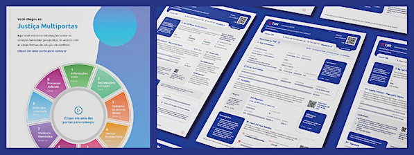
Villa is the leading company in Latin America specializing in Visual Law and Legal Design, recognized as the largest and most awarded in this field. Our main goal is to enhance legal communication, making it more efficient for the public and for businesses seeking transparent and accessible relationships with their consumers.
In this presentation, we are delighted to share two of the most iconic projects that mark our journey. We will explore the complete process of ideation, development, and the results achieved. The first project is the “Easy Contract for TIM,” a mobile telecommunications adhesion contract designed to transform store customer experience. We will discuss how we implemented Visual Law and Legal Design techniques in this contract, simplifying the legal content and making it more understandable and user-friendly for TIM’s customers.
The second project we will present is the “Visual Law and Plain Language Handbook,” created for the Court of Justice of Mato Grosso. This handbook was developed with the aim of teaching Brazilian judges the methodology of project creation using Visual Law and clear language. In addition to explaining how the handbook was developed, we will highlight how the implementation of these practices can encourage more effective communication between magistrates and the public, especially in complex legal cases.
During the presentation, we will explore the challenges faced during the development of these projects, as well as the benefits and results achieved. We will share valuable insights on how Visual Law and Legal Design can revolutionize legal communication, making it more accessible, understandable, and, above all, efficient.

Introducing Rui Caminha: Lawyer, digital entrepreneur, graduate from the University of São Paulo, currently pursuing a master’s degree at FGV-SP. Founder and CEO of Juristec+, co-founder, and director of Villa – Visual Law Studio. Legal Design lecturer, international presenter, with over 15 years dedicated to legal innovation, and pioneer in the development of technologies and solutions in legal data analytics, legal AI, analytics, and Visual Law.
- Call for presentations: Information+ conference 2023
22nd – 24th November 2023
Edinburgh, UK
The conference invites three types of contributions: Presentations, Workshops & Activities, and Exhibition Pieces. Proposals from all relevant fields and areas of professional practice, research, and pedagogy are welcome.
Information+ is an interdisciplinary conference that brings together researchers, educators, and practitioners in information design and data visualization to discuss common questions and challenges in these rapidly changing fields. Information+ seeks to foster productive exchanges amongst the variety of people involved in the theories, practices and pedagogies of analyzing and communicating information.
Submission deadline: May 31st, 2023
- Visualizing Complexity Science Workshop
Paul Kahn and Liuhuaying Yang offer a 5-day workshop on Visualising Complexity Science.
The Visualizing Complexity Science Workshop brings together multiple perspectives in information design and data visualization to create complexity science visualizations. Teams will combine researchers together with data visualization designers, data journalists, and data artists engaged in advanced visualization projects.
The program is designed to be diverse, creative and inspiring, offering a mix of lectures by the hosts, invited guest speakers from the international data journalism and visualization community, group discussions, and hands-on working sessions engaging with complexity science research datasets.
Location: Complexity Science Hub, Vienna, Austria
Dates: Monday August 28 – Friday September 1, 2023
Registration deadline: May 20, 2023
More details and registration: Visualizing Complexity Science Workshop Website